
How to design an eye-catching supplement label?
A high quality, eye-catching protein supplement label can be difficult to be create. The supplement industry is extremely competitive with lots of competition. So, it’s important to make a label design that’s eye-catching, fits your target market and allows you to be appealing to the right target-audience. Lets take a look at what makes an eye-catching and appealing supplement label design for your fitness brand:
Target a specific audience
What should your supplement label look like? Knowing who you want to target with your supplement brand makes a huge difference. It’s extremely common for companies to want to target a large audience for their supplement company which includes targeting males and females of all ages (don’t we all!). However, if we narrow down who your business wants to target more specifically, creating a supplement label for it can be far more effective.
Price and quality is a large factor when it comes to fitness supplement labels. We can consider things such as ingredients, taste, what the product does in terms of effectiveness and so on. Is it a cheap supplement company label design that’s required? Is it a potent, high quality supplement brand? These are good questions to ask yourself which will aid the label design your business requires. Is the product mainly for men? Is it targeted towards women? Or, is it all-natural with eco-friendly or vegan ingredients?
We can quickly discover who the target audience is, with a bit of thought. And, then, what the age group of the fitness business is, too. All of these elements equate to what the label design of your supplement company should look like.
Fitness models for your fitness brand
It’s an age old question; should you have fitness models, or strong people on your supplement label design? In some cases yes, in other cases, no. This depends on the target market and whether featuring people on your fitness supplement labels would be appealing to your target audience.
Supplement label design with a large range of products
Having a cohesive collection of label designs for your supplement brand is important. To show consistency to your target audience allows your customer to have more trust in the products you manufacture. In the fitness industry, this is important when it comes to supplement label design. It may impact the perception of quality, taste and consistency of results.
What fonts to use for a supplement label?
The use of fonts and typography really aids your supplement label design. To have an effective font for the design allows trust in the product (or product range). It helps the visual of the label design to a large degree, allowing it to help sell the product when chosen correctly.
What colours to use for a supplement label design?
Supplement label colours can often be dictated by the brands corporate colours, often coming from the supplement label logo design, or by flavour and effect that the supplement has on the consumer. Choosing colours is extremely important and can certainly influence the sale of the product.
An effective supplement label design allows products in the segment to sell. And, in a highly competitive industry with brands such as Optimum Nutrition, BSN and Australian companies such as Bulk Nutrients and True Protein leading the market, it’s important to design to the right target audience as much as ever.
What makes a good fitness logo design?
A good fitness logo can be hard to achieve. Lets face it, there’s a lot of competition around in the fitness industry and it can be easy to get lost in a sea full of fitness logos. Inspiration for fitness logos are easy to find, but there’s a lot of poor-quality fitness related logos out there. So, lets dive straight in and find out what makes a good fitness logo.
Target a specific audience
So, your fitness business needs a logo, but what should it be? How much does a logo design cost? Knowing who you want to target with your fitness brand makes all the difference. It’s extremely common for companies to want to target a large audience to their facility, males and females of all ages is extremely common. However, if we narrow down who your business wants to target more specifically, creating a logo for it can be far more effective.
We have to consider the area in which your facility is located, and the cost of visiting your fitness facility or service. Is it a cheap gym that requires a logo? Is it small group personal training that you’re trying to attract? These are good questions to ask yourself which will aid the logo design of your business. Does the studio mainly attract women, or is it that really grungy, male-dominated, strength gym that you’re operating?
We can quickly discover who the target audience is, with a bit of thought. And, then, what the age group of the fitness business is, too. All of these elements equate to what the logo design for your fitness business should equate to.
Small fitness studio logo design
A fitness studio that’s small, intimate and personable should have a logo design that represents those features. If the class sizes are small, then creating a logo to represent a fitness facility that is close, warm and friendly should be represented in the logo design.
A consideration should also be the location of the small fitness studio, whether it’s in trendy South Yarra or Prahran, or in the outer suburbs of Melbourne, for example, would make a big difference to the target demographic of the studio, and potential the cost of membership / price per session.
Franchise fitness logo design
A logo for a gym franchise is a little bit different to a small fitness studio. A consideration comes more about location and cost of use. This should be represented in the logo design for a franchise fitness business. Can the member use a key fob and go to multiple fitness facilities, like Fitness First, Anytime Fitness, and so on? Are the studios located in inner Melbourne, or are they scattered throughout Australia?
Gym logo design
An independent gym logo blends the above two features together. It might be the fact that the gym is large (or small), cheap (or expensive) and location/s are important to consider too. Again, to atrget the right audience with your gym logo design is critical to its success. It may also be an online fitness store logo design that you're after, similar to World Fitness Australia. The same rules tend to apply for these, too!
Personal trainer logo design
When I consider personal trainer logo designs, I think the personality of the trainer is a bigger factor. The logo I designed for Apex Training gives a great insight in to my thoughts and process and you can also read about their logo design case study. It might be their specific training style that has a higher consideration, along with location, gender and potential clientele.
It’s extremely important for a fitness logo to be relevant to the target audience of the gym, facility, clients and demographic of their clients and prospective members. To have the right logo design is one thing, but branding is also extremely important to really capture the audience you want to.
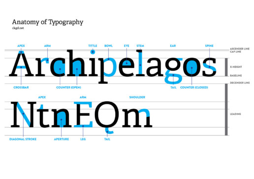
Anatomy of Typography - Letter features and characteristics
Sometimes it can be difficult to explain and identify the different features of a typeface. So, let's take a look at the anatomy of typography!
What is type and lettering?
Type and lettering is something we see every day of our lives. It's used for print media such as signage, brochures, in store, flyers and so on. It's also used digitally on the web, whilst we sift through Facebook and Instagram posts, blogs, or the latest Reddit news.
Typography features and characteristics
So what did I do to help indentify features of type? I've put together a poster, which I have hanging up in my office! It contains all the significant features of type, pointing out features such as a stem, eye, bowl, counter, arm and so on. I've also included x-height, leading and baseline, which identify features outside of the characters themselves. Not only does it help explain certain features, but is also super interesting to have a little bit of extra knowledge regardless of if you're a Graphic Designer or not.
I have excluded a few type features, but the everyday, common features have all been included. This is a great guide for professionals and students alike.
What other posters would you like to see made as a graphic design resource? Comment below to tell me what you'd like to see created!
You're welcome to download the file as a reference or bookmark this page. I've included a link below.
Have fun with type!
You can download the image below.

Why is Graphic Design Important for Small Business?
A common misconception business owners have is that Graphic Design is a quick and easy task that they can often undertake themselves, if they have the time. You’ll look at the website, social media stream or print design of their collateral, and quickly recognise that they’ve created their branding themselves. The reason business owners do this, is because they believe Graphic Design is simple enough, and to save costs whilst still believing they’ll have the same outcome, is at the forefront of their mind.
Your small business branding is highly considered by customers, they view perception of trust, quality and cost through your design.
For a small business owner, their business is like their baby. It requires careful consideration, which often they believe can be done by themselves. However the issue is that a brands image, and the person buying their product or service isn’t them. It’s the outside world, it’s customers and clients. These are people with emotions and feelings. Catering to them surely comes before selling your own business to yourself.
Graphic design is a highly specialised field where the key focus is to create visuals fitting a brands direction, their customers and target demographic. These visual communications can include:
- Logo design and company branding
- Product packaging
- Brochures, books & magazines
- Websites
- Business cards, flyers and letterheads
- Digital & print advertising
- Signage
A brands imagine is typically conveyed through their logo, symbols and illustrations, colours, fonts, words and verbiage, photography and overall style of the company. What makes Graphic Design so important, when created by a professional, is that this material is targeted to the right market, and creates a call to action which allows you to sell your product or service. For your customer to take action when displayed with your visual is key.
 Why invest in a Graphic Designer, and how will it help my business?
Your First Impressions Matters
Your customer may only have a few seconds to take in your key visual, whether that’s via print or digital design. It may be product packaging, your website, a post on your social media feed, a flyer, business card and so on. Your first impression is what matters the most. Using colours, fonts, illustrations, photography and a consistent visual brand that your customers will appreciate can be enticing enough. A brand style guide can help align, and moderate this to give your brand consistency, but it’s critical to stick to those guidelines.
Consistency of design and marketing is key
To be consistent with the way your brand is displayed to your target audience is key. It can play a pivotal role in your customer having trust in your brand. Elements of predictability, through the use of placement of objects, type of visuals, and brand messaging can assist the consumers decision making on the brand. Is it proven that brands with consistent branding and marketing have better revenue than those who don’t.
Company Loyalty
As mentioned, customers love to see consistency in a brand. To be able to have a certain level of expectation and stability in a company, knowing the type of result they will get, aids loyalty by customers. They will stick with your brand if you have consistent messaging and design language in your collateral. Graphic Design allows your brand to have a level of consistency whether it be direct or indirect marketing, their brands visual guidelines.
A leg up on your competition
Graphic Design, and the way your brand is perceived, can be the difference as to whether or not a potential customer goes with your business. A brand with consistent visuals appears to be far more trustworthy than one without. You could imagine if you were looking at a product and service, and their branding appeared to be inconsistent and sloppy, then you’re unlikely to trust the brand. A brand with consistency will hold a customer’s attention for longer, and certainly assist with the sale over the competition.
Seeing results from the beginning
Starting a business is tough, we can all agree with that, but the ability to see results from the start can be critical to whether or not a business succeeds. Business owners will tend to start a company with a certain target audience in their mind, and a way they want their brand to be perceived. It can be extremely difficult to bring this idea / concept to life without the help of a Graphic Designer – someone who specialises in visuals for brands. With a good Graphic Designer at your disposal, you can make effective decisions and target your desired market. It’s important that the Graphic Designer realises who you wish to target just as much as you know who you want to target. With a successful beginning to a business’ trading means that they wont need to rebrand soon, and can allow the visuals of their brand naturally grow.
The impact graphic design has on your business is profound. And, more critically, it’s essential as much as at the start of the company’s life as it is when it’s been around for a few years. To invest in a professional graphic designer can assist all sorts of communication decisions your company wishes to make, whether that’s social media messaging, website messaging, print messaging, etc. As a professional graphic designer myself, see how I can help your business with a professional graphic designer at your disposal, and grow your business like it deserves to grow, with love, care and consideration.
Creating Custom Health Care Logo Designs
I've been lucky enough to work with a few Health Care companies now, and created a lot of logos for the medical field. And, in my 10 years of Freelance Graphic Design experience, I've seen a lot of old logos which are in desperate need of a redesign, and also some new companies and services who don't even have a logo to start with. All the amazing work that the Health Care sector has been doing to start 2020 has given them (deserving) more recognition in light of COVID-19. Having completed hundreds of custom logo designs, I know a thing or two when it comes to successful logo design for a company in Health Care.
![]()
Before and After of the Medical Informatics Logo I designed.
Colour choices are important
The use of colour in the medical field is so important. Colour can invoke emotion to the viewer, so careful selection of colour palette is important. Health Care is a critical sector to get right, because the patients feeling towards the service is paramount to their trust. We know that health care, especially when it comes to medical and operations, is representitive of the colour red. However, is that the best colour to portray the business? This is a case-by-case scenario, of course.
Blue has been, and always will be a colour of choice in the medical field. For businesses in health care, when it comes to logo design, blue is a feeling if calm and cooling (the situation, environment, etc) of the subconscious mind.
![]()
A concept for Paul Manohar Urology, showing a part of the kidney function.
Symbol design in logos for medical practitioners
It can often be requested that a needle, crutches, bed and other medical tools or devices make good a good symbol for a logo. Yes, they identify in a very stereotypical way the service, but how does the patient feel when they see the logo? Styling the symbol, along with colour, can offset the feeling, but the majority of the time, especially if very stereotypical, the patient may feel sensitive. So, it's important to be careful with symbol design for a logo for the medical field.
Choosing a font for health care logos
Similar to colour and symbol in a logo design, the font (or more specifically typeface), is an important choice. The typeface of choice usually reflects how professional and reliable the service is. So, typeface choice give fulfill part of the confidence element of your service which may allow the patient to get in contact with your service.
Designing custom logos for the health care industry is important. Just like the medical service itself, and the patient having trust in the doctor, nurse, practice (and so-on) on a personal level, the logo and branding for a business in this field can also be a true reflection on how much they value the service they provide and the feelings of their customer. I've seen success in the logos I've created for practitioners and health care providers, which is so great to see, and all their hard work, not only during COVID-19, but always, shouldn't go unnoticed.

5 Ways to Re-energise your Brand using Design in 2020
Everyone can certainly agree that the start of 2020 has been tough for a lot of individuals and companies alike, with Coronavirus. Here in Australia, we’ve also had to battle bushfires over the New Year, resulting in a large downturn in business for a prolonged period of time.
However, with every dip comes a rise, and the light at the end of the COVID-19 tunnel is gaining momentum. With the release of the COVIDSafe app, many people in Australia are hopeful of a return to normality, and for businesses this means reopening. It’s important to reopen safely, so customers can regain trust in your business. Graphic Design is a great way to demonstrate trust, along with well written articles and collateral to assist your design.
To spark interest in your product or service, it’s important to jump the competition, and knowing when that would be can be tricky, but to be ahead of the eight ball is certainly an advantage. We’ve already seen how some companies are already doing this.
The design may be slightly different to your usual, strict brand guidelines, but by having a slightly different design shows versatility in your company too. Customers will love to see you being more approachable that usual, if your companies design doesn’t lend that way.
In my ten years of professional design experience, I’ve had the opportunity to refresh many brands and these five methods are a great way to re-energise your brand through design marketing in the upcoming months:
Using design in social media to promote your business as a whole
By using social media to promote your business as a whole is a great idea at the best of times. It can also be used to target a specific service or product, and that’s certainly fine too. However, with some clever graphics and design, using social media to promote your business as a whole is very important. In a time like this, creating a design visual that is friendly and approachable is what people really need. Businesses want to allow customers to feel as though their brand is trustworthy, so using certain colours, imagery, cues and typography can allow that to be the case.
Reminding customers through the use of Facebook, Instagram, Twitter and LinkedIn or any other social media platforms that your company utilises, that you still exist, is important. To demonstrate that you’re looking out for them, and supporting them through this period of time (even without trying to sell a certain product or service) can be great messaging for them. The design used to do this can be different to your usual style, but doesn’t have to be too separate from your brand.

Future-proof your business through design
We know that, when COVID-19 ‘finishes’ that the world will be a different place. Designing collateral, such as print and web advertising knowing what will be different in the future gives you a jump-start on the competition. Will people be outside more? Have people taken up new hobbies, such as cycling, running and walking? Maybe people are reading more books, or using LEGO more (I know I am!). What this means, is if you have an in-demand product or service, which allows the freedom and escape that people are after, your business could thrive using design to communicate that message.
I know if I had a business that allowed people to be outdoors, have fun and use their product or service, that now would be a great time to design based around that. Using design, along with well thought out marketing and text, can certainly get that message across.
Designing promotional material for a product or service
We know plenty of businesses and individuals are struggling financially, so having a marketing campaign designed around having a sale for a product or service could be a good idea. Through the use of design, this can have surprising effects too, and whether it’s a print or online focused sale, the design can still be eye-catching and engaging for your customers. It should also be considered that if you have a product or service which is in demand, that helps a customer through this period of time, that a customer will love to reach out to you if you offer a product or service to them.
Designing for a sale should be tasteful and respectful to the customer your targeting. Showing value or worth through design, through the use of colour and type can help. Designing a campaign with different variations of the one product can also allow the campaign to market towards different customers.

Using an engaging website design to sell and market products
You don’t necessarily need an online store to sell your product or service. It is, of course, and option for many, but not critical. A website design that is informative, visually interesting, accurate and usable also, in fact, sells a product or service. Many website designs used for marketing result in a contact form, phone number or email address (much like my own), but to visually communicate the right message to customers is one of the most important messages to get across. This, of course, is done through the use of graphic design and visual imagery.
Having your website reflect the current situation of the world, and having a calm, understand tone and visual imagery not only allows your business to show that you care, but speaks to your customers and notifies them that you’re still in business.

Design for your customers and make them feel wanted
I stress, in most of the material I write, that designing specifically for your customers is so important. When your customers are unsure about what to do to begin 2020, showing that your business is calm and stable through the use of design reinforces what they already know. However, as I said earlier, to perhaps alter the colour palette in a smart, concise way or altering the typography and products and services you specifically market can be exactly what your customers are looking for. If, by promoting to help them through isolation, and your product or service will help them achieve that, then design collateral with that at the forefront of your mind. Designing marketing material which soothes them, and relaxes them for the now, but also can re-energise them (and your brand) in the future, is reassuring.
So, those are my 5 pieces of design advice to you, and your business, to get you through this difficult time. I know 2020 has been a difficult start for many businesses not only in Australia, but around the world, but by designing material that can get you (and your customers) through this phase and also assist your business when everything goes back to ‘normal’ is critical in the success of your business and customer retention.
When to rebrand and give your company a fresh new logo?
It can be difficult to know when to complete a company rebrand, especially because workflow and customer quantities can change so quickly and with a certain amount of unpredictability. As we all know, a lot of considerations need to be accounted for in order to rebrand. Should you do it when your company direction changes? When business is starting to slow? Just because it's been a certain amount of time? So, when is the best time to give your company a fresh new logo, brand and identity? Lets take a look, dive in and try and find out!
Company duration – maybe it's time for a change!
A lot of companies will say to themselves "I've been in business for 3 years / 5 years / 10 years – maybe it's time for a change in logo." If we think about what you're really asking yourself in this question, it's purely that you're bored and feel like the company needs a facelift. Maybe it does, maybe it doesn't, but time alone isn't a defining factor as to needing a change in logo design and branding for your company.
Duration of a business can be, and is, a good thing. To have a business gather and maintain traction of a period of time means that ultimately there's an element of success. You have to ask yourself why you would change the look of your company, and if it's out of boredom then that's probably the wrong was to look at your company.
 When business is failing / starting to slow?
It could be argued that during slow times, a new logo may not benefit you, as resources could be thinning. However, to have a new brand and logo in this period of time could be exactly what you need to gather traction once again. A new, fresh look for your brand allows you to market more, to tell a different story and to generate a talking point where there wasn't one.
A new logo for your business, in your eyes
If you think about a new logo and what it does to the mentality of the business, and your mentality, it gives you almost a fresh start. Depending on the new design and how close it is to your existing branding, change here can be considered a good thing. It plays a little bit into my next point, but the ability to re-market with a new, revised direction, to be proud once again, a new vision and hope can be extremely revitalizing for all involved.
A new logo in the eyes of your customers
Customers can appreciate a new logo – they've done it for years. The new talking point that you're generating, gives the customer a new perspective about your business. For them, it can almost feel like having a shower and feeling fresh again. If they see your product or service with a new logo and branding, they may consider you once again, whereas they may not have with the same branding as is ingrained into their mind.
A change in company direction
The single most important reason to rebrand is because the existing company logo and branding doesn't resonate with the message your company is trying to portray. If your logo is outdated, both in style and message, then your customers will be able to tell. And, if we draw that connection back to my previous point, where business is failing and starting to slow, it may be because of the misdirection in your current logo and branding. If your product and service isn't fitting for your socio-economic group at the time, then visual communication is lost between company and customer.
The same can be said for branding, where the logo may actually still be fitting, but the branding surrounding the company logo may need to be adjusted to connect with the customer.
How COVID-19 / Coronavirus is Influencing Marketing and Design
What a world, hey? Hasn't everything changed in the last few months, with the spread of COVID-19 / Coronavirus, companies around the world are changing their marketing due to the pandemic. Whether it's companies closing their doors, or struggling to survive, others like supermarkets are generally thriving and struggling to keep their shelves stocked with essential items.
However, a few big companies have tried to take on innovative, new ways of marketing through the use of design and social media. Social distancing was a word not too common 3-4 months ago, and now it's a household term, known all around the world. Whether it's to keep 1.5m metres away, or 6 feet, whatever measuring system you'd like to use, it's so important to control the spread of the virus and reduce the risk.
Lets have a look at a few companies and how they've used design to encourage social distancing due to COVID-19.
Audi Social Distancing Logo
![]()
Audi have spread their rings, usually joined, to demonstrate social distancing in their logo. They're encouraging people to 'keep their distance' with a message and video from one of the biggest automotive brands in the world. Simple, effective and animated, moving the rings apart from each other clearly gets the message across to their viewers.
Mercedes Benz 3 Pointed Star Social Distancing Logo
![]()
As you continue through this article, you'll notice a bit of a trend – auto makers. Anyway, Mercedes Benz joined in the social distancing logo trend for COVID-19 by altering their three pointed star logo, moving the points away from the outer ring. They encouraged people to 'stay at home' to stop the spread of the deadly virus.
Volkswagen's New Logo Demonstrates Social Distancing

Volkswagen recently updated their logo and it hasn't taken long for their designers to start playing around with it in creative ways. Like Audi and Mercedes Benz above, they've "social distanced" the contents of their logo, this time separating the V from the W within the outer ring of the logo. It's perhaps not as... beautiful as the two above logos, but the message still gets across, and further thanking people to keep their social distance through this time of crisis.
McDonald's Arches Separate To Demonstrate Social Distancing

The last logo I've spotted which has encouraged social distancing during COVID-19 is Brazil's alteration to the McDonalds logo. By separating the famous golden arches of the McDonalds symbol, social distancing surrounding Coronavirus is encouraged. It's hugely strange to see such an iconic logo altered in such a way, and has also come under some criticism in the media for doing so.
I'll certainly be keeping an eye out for any other logos, marketing media and advertising that encourages social distancing during the time of Coronavirus. It sure is a changed world, and safety is paramount in this time. The message that Audi, Mercedes Benz, Volkswagen and McDonalds have provided is a reminder with good intention, but also gives their companies exposure in what is not only a health crisis but an economical one too.
6 Rebrands of 2019 that got the Design Community Talking
I know, I know it’s 2020 but I’ve been looking back on logo redesigns of last year, and I really wanted to write an article about them. We had some big ones (and will have more redesigns in 2020 no doubt) including Firefox, Staples and Zara to name a few. I thought I’d write a quick article to discuss some of the best from 2019. Leave a comment below and mention your favourite (or not so favourite, that’s OK too!) of last year.
1. Mozilla Firefox
A simplification was undertaken at Mozilla for their Firefox logo. It’s certainly got more modern traits of a logo, with elegant lines and some striking new colours within the symbol itself. A major change in their logotype is also a key feature of their revised logo. It has to be said, the iconic fox seems to be made way for more of a ‘swoosh’ shape. All in all, I think this is a positive rebrand and a much more sophisticated look over.
2. Zara
This Spanish apparel giant had quite a lot of people talking with their brand new wordmark. Four letters, and an already very stylish logo – what could go wrong? Well, designers around the world hated the new kerning of letters for the revised logo, mainly because of just how much the letters overlapped each other. It’s still, to this day, has a lot of people generally hating the new Zara logo and has been very controversial. Is it readable? Perhaps – just. The elegance and class of the old logo makes this re-design, or brand evolution, a negative one.
3. Staples
Another massive retailer, this time Staples, went a big rebrand after it changed it 25 year old logo for a much more literal design. Now, the literal sense of the staple stands beside the world… Staples, funnily enough. The CMO Mashall Warkentin stated that the symbol “is symbol of the commitment we are making to our customers.” And, many viewers, both designers and consumers were divided about the look of the new logo.
4. Slack
The rebrand of Slack uses a simpler colour palette and is generally trying to be more refined and scalable. But, is it? Has it actually gone backwards in its evolution? Many would question the new Slack logo, where the old logo does, in fact, carry more modern web-based traits than the new logo. The colours used in the revised logo look like a bit of a mish-mash of tones and hues.
5. Android
A lot of the cues behind the revised Android logo look to be based around the Google rebrand to make it more accessible. The famous Android robot character remains, but in a much more vibrant (and visibile) green colour. But my favourite part of the new logo is the typography used in the logotype. It’s so much better than the retro looking Android type of logos gone by. And, all in all, the logo does align much closer with the Google Brand.
6. Volkswagen
A new, sleeker look for automotive company Volkswagen could be considered damage control after the company has had so much trouble with emissions scandals. However, it probably also directs itself more towards the way of an electric, more streamlined future. Automotive companies are moving towards lower emissions, cleaner more purposeful lines and Volkwagen is just another one of those companies.
Logo Design Cost & Process
The cost of a logo design varies from country to country, designer to designer and client expectation to, well, client expectation. It can be a hotly debated topic, where people often question why a logo will cost so much. Well, I’m here to try and explain the cost of a logo and give an explanation as to why I charge what I do for a logo.
The logo design process
The first thing to discuss is the process itself. It’s a multi-step process that can involve such things as research, brainstorming, sketching, comparisons, concepts and revisions. And, with so many variables, that’s part of the reason why a logo ranges in price. From the outset, I’ll say that I don’t have set prices for logo designs, but I do have ranges that I can estimate what the cost will be based on past experience.
A logo can be used in so many different places. And, before you jump on Fiverr and find the cheapest, ill-considerate designer you can find, think about the cost of running a business and how much a logo actually means to the business. Do you ever look at company logos when you visit a website? In a shopping centre? On products? Do you make snap decisions on whether or not you’ll buy that product based on their logo? You might actually be surprised how many people, yourself included, make decisions on what jam to buy, or what gym to join or what clothes to wear based on their logo design alone.
So, a logo can live in many different places; online, digitally, printed on business cards or shop walls, marketing material and so on. And all those variations can result is multiple logos being needed to be created. Logo file formats are usually in raster or vector.
Raster vs Vector Logos – What's the difference?
Raster files are measured in DPI (dots per inch) and have a file extension such as .jpg, .gif or .png. These files are based on pixels, which are set dimensions. So, increasing or decreasing the size may result in pixilation or distortion. That is because the computer is working out where to fill in the pixels.
Vector files can be scaled to any size you can imagine without losing quality, which is great for printing (think billboards) all the way down to social media posts and email signatures. They can also be opened, edited, and saved in different applications, and have a file extension of .ai, .eps, .svg or .pdf. But don’t be fooled, some people place raster files inside vector files – these will not act the same way.
Colour variations of Logos
It should also be noted that logos need to be visible as much as possible. Their usage can vary too, so it’s important to have the logo designed in different colour combinations to make this possible. You’ll generally need light, dark, full colour and monochrome variations of the logo. I like to supply black and white logos for the times when a job might also be set in black and white.
We’ve also got colour options such as RGB (for digital logos), CMYK (for printed logos) and Pantone logos for spot colour jobs.
Costs / Packages of logos
Agencies can charge quite a lot for a logo design. The reason is because of their large overheads and staff that they have to pay, which is fair enough. I generally don’t charge close to what an agency charges which can be between $5,000 - $10,000. For a business, this can be a substantial outlay especially if you’re a start-up.
I tend to charge less, because whilst I have the experience of an Art Director, I still call myself a Senior Freelance Graphic Designer, because I feel like that’s a more suitable title for me. In fact, I’ve had clients who have come from having a logo developed by an agency, not been happy with their job and come to me to get a higher quality logo at a cheaper price.
My process and costs
I generally ask for a 50% up-front deposit to commence the logo design process. This allows me to have confidence in the client, and the client has confidence that project is underway. I’ll always ask the client information about their business. I’m invested in problem solving the situation to create, what I believe, is the best solution for the client.
So, what is the best solution? Well, you may have read in my other articles that targeting a specific socio-economic group and target demographic is the most important thing. This is because you want the logo and brand to appeal to a specific person – the person you want to sell to. This could be a wealthy 65 year old male from Brighton in Melbourne who loves expensive cars. Or, it could be a uni student just scraping through with rent each week and just wants the cheapest gym in town. Either way, your company has a market it wants to hit, and a logo can be massive in targeting the correct crowd.
So, analysing your business with key information is critical. Are you big, are you small, have you been around for 30 years, are you close to the beach, who’s your competition, your market, where are you selling, and so on. So many answers do I want to pack into your logo to design it the correct way. It’s a very psychological and meaningful process that deserves consideration.
Logo concepts and revisions
I generally create three logo concepts first up. I think it’s important to suss out which direction the company can go in, and which of the critical information that I spoke about above, needs to speak the loudest (in the logo). I ask for feedback from the client, to see if my analysis is correct. Majority of the time it isn’t too far off the pace, and a good brief from the client usually makes this the case.
Some designers give a set amount of revisions like 2 or 3, and price their logo based on that. I don’t agree with that process, because if a logo fits after the first revision, then that’s a resolution. If it takes 4 or 5 passes, then perhaps the brief, or my interpretation of the brief, isn’t correct. That doesn’t mean it’s job over, so it’s no stress, it just means that further clarification may be needed.
All of these variables I talk about are reasons why I don’t have a set-in-stone cost. However generally a logo for a small business will cost between $1,500 - $3,000 which is substantially less than an agency. And, I like to think that I put more care into a logo than an agency would too (but I’m bias)! For mid-sized companies, or companies with more exposure, this cost can be more. Somewhere between $2,500 - $4,000.
So, if you’re thinking about getting a logo design created, hopefully this article has helped. I’d be more than happy to discuss your business and requirements with you and give you a more accurate figure. I’ve done a lot of logos now, backed with 10 years of experience, that I have a good idea as to how much your logo could cost.
All the best on your logo making journey!
Business Card Design - Updated 2020
Think print is dead? Think again! I've updated my business cards for 2020, and I thought I'd show you what I've come up with. The aim, for me, is to hand these out locally to friends, family and prospective clients in and around Melbourne. And, just to make things interesting, I've done them a little differently this time.
Business Cards of the past
I've had business cards in the past – many times. I've run out of them, had too many, changed the design (and size) of them, and so on. But, that's the great thing about business cards is that they're meant to be disposable. Hand them out, promote yourself, show your business or service off. They're designed to be a marketing tool and, yes, I still hand them out to this very day with some great feedback. I tend to opt for high quality, custom cards, because I think it's quality over quantity. However, that's more my way of marketing my business. Every business is different. I've decided to make a few changes to my cards for 2020 to further create a talking point yet, most importantly, be a great keepsake for potential clients. Should you leave with a point of contact, or just leave? I know what I'd rather!
So, what have I changed for 2020?
This year, what I've done is create my logo in silver foil. Why? I think it's a bit of brand evolution for me, a little bit more daring and playful. It's a great talking point too – people who've viewed them have already tilted the card to see the different light that it reflects. I'm not saying that a foil, whether it be silver or gold, is a must (I have matte black business cards too) but it certainly adds an extra interest to the card, especially considering that 9 of the 10 variations have abstract art that I've made featured on the card.
What I've retained is the heavy, high GSM stock of the card. They feel absolutely incredible. Soft, yet very strong and durable. And, to compliment (or contrast, I should say) the silver foil of my company logo, I've gone for a matte finish.

Why have I changed my business cards this year (2020)?
The reason why I've got so many variations for the cards, is because it's 2020 (new year, new me, etc) but secretly because the viewer will often get to choose the card they like the best. I think it's good to have choice, and it's also great to have feedback on your work all at the same time. But because my business cards are such a talking point, it encourages conversation. It allows me to explain what I've created on the card, why I've done it a certain way, and so on. Everyone is talking digital, and don't get me wrong, digital is great. However, print genuinely card get people talking. My new business cards are an example of that.

I love the silver foil I've used on my new business cards. They always look different, they're unique and, because people aren't using business cards as much any more (why not?!), they're even more of a talking point than they were in the past.
So, if you've had business cards in the past and you think – yes! This year, 2020, I need new business cards, then lets hear from you and make it happen.
Feel free to add any feedback about the cards in the comment section below, because as always, I'd love to hear your feedback about them.

Supplement Label Designs and Requirements
Now that I’ve designed for quite a few supplement companies, I’ve got a good grasp on what’s required for supplement label design, how it can be applied on packaging, marketing features and elements, hitting key fitness demographics, and so on. Supplement design, whether it be whey protein powder, a fat burner, casein, (the list goes on doesn’t it?!), is a super competitive industry. And, the clients I’ve had requesting their brand on supplement labels has ranged from start-up entrepreneurs, hobbyist, personal trainers, to larger, more established companies.
Design Requirements
First things first, you need to know what type of products you want to sell. As I mentioned, (and if you’re reading this article you’re bound to be interested in all things supplements), there’s so many different types of supplements in the fitness industry. So, knowing what you want to sell is critical, because more often than not, that will dictate the size of the packaging required. Furthermore, the quantities of protein (for example) generally comes in quite a number of different sizes, in different types of packaging. Some are zip locked, some are in tubs and some in sachets.
Nutrition Information and labels
When a food product is sold to the public, generally a nutrition label is required to go on the product packaging or label. I’m specifically going to talk about Australia and the United States here, and say that both countries do require this information.
 Even stylistically, the nutrition information needs to be designed in a legible way. This can be quite complicated, so please refer to some of these websites which may help:
Australia Food Labelling
Food Standards Australia Nutrition Information Panels https://www.foodstandards.gov.au/consumer/labelling/panels/Pages/default.aspx
Food Standards Australia Nutrition Information User Guide https://www.foodstandards.gov.au/code/userguide/Documents/Userguide_Prescribed%20Nutrition%20Information%20Nov%2013%20Dec%202013.pdf
Australia Made Logo Use https://www.australianmade.com.au/for-business/using-the-logo/
United States Food Labeling
FDA Dietary Supplement Labeling Guide https://www.fda.gov/food/dietary-supplements-guidance-documents-regulatory-information/dietary-supplement-labeling-guide
FDA Nutrition Labeling https://www.fda.gov/food/dietary-supplements-guidance-documents-regulatory-information/dietary-supplement-labeling-guide-chapter-iv-nutrition-labeling
Often the Nutrition Information will be supplied to me by the client. It is their duty to supply the correct information and guidelines for me to complete.
Using a Template Maker
A template maker for supplement design is often a really cheap, inefficient way of doing business. Calculating the costs involved in using a template maker, how often it’s been used by other companies all around the world, legalities, specification sizes and so on, is extremely risky. It would also be a time where, if you find yourself going down this route in business (in general), you might need to ask if you can afford to run a business. A template maker, whilst useful for some things, would be extremely risky.
Let’s talk about custom supplement label design
Ok, onto the fun stuff! Custom supplement label design, something I specialise in, is what I know best. We have some key areas to focus on here, and they include logo design, software, target demographic, style, and printing types / substrates.
Logo Design for Supplement Companies
I’ll talk about target demographics a little bit later on in the article, but logo design is critical to the success of a brand. So much design aesthetic stems from a logo design. There’s so much consideration that needs to take place and if you’re an experienced Graphic Designer then you’d recognise what has the ability to work and what doesn’t. So, please read further down the article where I talk about appealing to a target audience, because that pertains to logo design too.
One of my favourite logos I’ve created is for Nitracore, a more hardcore style supplement brand. I created custom type for the company specifically directed to appeal to their target audience.
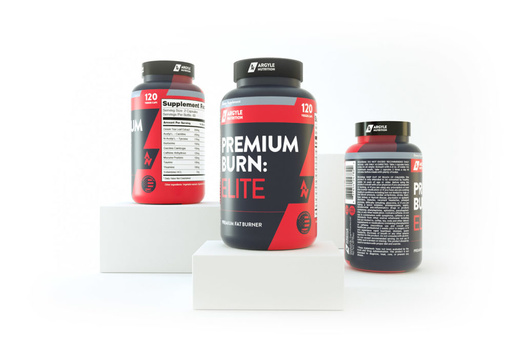
I’ve also created a logo for Megathom, Argyle Nutrition, Monster Performance, Primo Performance and a few more companies.
![]()
Software to design supplement labels
Generally, labels I design for clients are created in Adobe Illustrator, Adobe InDesign or Adobe Photoshop. However, it’s usually a combination of two or three of those. Consideration of size of label, resources (like photos, the company logo, and so on), and quantity are assessed. Adobe Illustrator is great for label design (and company logo design for that matter), because of its sizing (un)restrictions. The majority of print based work I create for labels is created in Illustrator. InDesign is really useful for larger quantities of work, so if you have a lot of labels to be created in many variations, this could be my choice of software. Photoshop is generally better to make edits to photos and photo manipulation, mocking up products and so on.
Speaking of mocking up products, this is something a lot of clients end up requesting for their fitness business. To show photo quality renders to customers, without the use of actually hiring a photographer, the perfect setting, and so on, is so appealing. You can also rotate the product on different angles, so showing it on a gym floor, or presenting it in a nice, natural (or in some cases, really abstract and stylistic ways) is so engaging. I generally use Cinema 4D – one of the most powerful 3D rendering programs in the world – to create the product renders.
 Designing appealing labels for customers
Supplement labels are no different to most other print-based graphic design work. Considerations for who your target audience should be at the forefront of your mind. For me, that’s certainly the case. Identifying who your customer is could involve the following:
- Location of the customer. This could be as specific as your local area, state, country, multiple countries and so on. Even with the internet, it’s important to realise who are typically visiting your website.
- Physical abilities of your customer. Are they just starting out in fitness? Is it their hobby? Are they semi-professional? Professional athletes?
- Age of your customer. Younger demographic? Older?
- Gender specific product or a skew towards a certain gender.
- Your main competition. Are their labels similar to yours? How can you differentiate yourself from the competition?
- Cost of your product relative to the competition. This is so important, because often consumers will look at your product side by side with another, similar product. If their protein powder looks and feels more expensive, that may mean that they opt for their product, or end up using yours because it in fact looks and feels cheaper.
Often clients will approach me and state that they want their product to appeal to everyone. And yes, that would be fantastic! However, it’s never the case.
If we look at a company like Optimum Nutrition, for example, who are iconic with their label designs, they’ve made their labels appear expensive, the typography used demonstrates their product is more geared towards hobby to semi-professional athletes, at a mid-range demographic and a slight skew towards males. With all of that considered, the price point for a brand like Optimum Nutrition is generally more expensive, and that’s because of their more luxurious look. Now, they also have the backing of reputation, too.
Supplement Packaging, Bottles, Sachets (etc).
After the logo and supplement label is designed, often clients will print their labels onto tubs, bottles and sachets depending on the sizes of their products. There’s such a wide range of options in regards to printing.
A few options could be:
- Matte / Glossy Paper
- Silver Metallic Paper, sometimes with a white underprint.
- White Film BOPP Polypropylene which is great because it’s waterproof and tearproof
- Clear Film BOPP Polypropylene
- Chrome Film BOPP Polypropylene
There’s a range of costs involved in regards to quantities, types of print, quality, paper and so on. They’re best discussed on a case-by-case situation.

So that’s about all for supplement label design in terms of a general guide. I hope it’s helped give you a better understanding of what’s required. Feel free to contact me if you have any questions!