What comes after logo design?
When operating a business, you need to consider many factors when thinking about the brand. Competition is tough, and as a business, you need to differentiate yourself from your competitors. Having a strong, recognisable brand is one of the best ways to stand out in your industry. But what does having a strong brand really mean?
Branding has always been a vital part of business, but with the virtual landscape growing, a strong branding strategy is more important than ever. Branding is a lot more than just a logo. While designing a logo for your business is a great start, what comes after? Let's walk you through the next essential steps that come after creating a logo for your business.
![]()
The Importance of Brand Strategy
The difference between your brand strategy and your brand as a whole is that your strategy is what sums up every aspect of your business like your name, logo, style, and marketing. Your overall brand strategy should emphasize the entirety of your business, the problems your business solves, and why customers should invest in you. Naturally, a brand strategy involves deeper incentives than just a great logo. Here are some ways to move your business forward after a logo design.
Create a Style Guide
When it comes to owning a business, consistency across all visuals is key. By keeping consistency, businesses can control customers' perceptions from first engagement through the buying process. A visual style guide is a way to keep branding and graphics uniform across all marketing materials. When making business essentials like a website, social media posts, or brochures, you want all visuals to match your logo. This includes graphic styles, like minimalist or abstract, color pallets, and typography. Having a style guide will give clarity to all marketing decisions made for the business.

A conclusive, usable colour scheme is an important part of a styler guide
Incorporate Branded Assets and Materials
After creating a perfect logo, as well as a style guide to help keep consistency, it’s time to make branded materials. An important branded asset any business should have is a website. Websites are your virtual front door, and it's crucial your website matches the aesthetic of your brand. Other branding essentials your business needs are printed materials like business cards, brochures, and correspondence. To portray professionalism, having formal communication correspondence will prove your business is a reliable partner.
Start Marketing Your Business
After creating a strong visual presence that truly tells the story of your brand, it’s time to start marketing your business. Having a strong marketing strategy is one of the most important aspects of getting new customers. When done correctly, marketing can be the most powerful tool to use to present your brand image to those looking to invest in your business. Utilising the branded materials in your arsenal can build brand familiarity, higher customer engagement, and authenticity with your audience.

The Origin logo incorporated into label design, with fitting typography and colour scheme.
Ready to Get Started?
If you have already worked with a designer to create a great logo, you are already on the path to success. Now it’s time to take that logo and turn it into a full-scale branding and marketing strategy to push your business forward. The more consistent your brand, the more trust your audience will have in your business! If you have any questions about what to do next, please get in contact with me!
What makes a good fitness logo design?
A good fitness logo can be hard to achieve. Lets face it, there’s a lot of competition around in the fitness industry and it can be easy to get lost in a sea full of fitness logos. Inspiration for fitness logos are easy to find, but there’s a lot of poor-quality fitness related logos out there. So, lets dive straight in and find out what makes a good fitness logo.
Target a specific audience
So, your fitness business needs a logo, but what should it be? How much does a logo design cost? Knowing who you want to target with your fitness brand makes all the difference. It’s extremely common for companies to want to target a large audience to their facility, males and females of all ages is extremely common. However, if we narrow down who your business wants to target more specifically, creating a logo for it can be far more effective.
We have to consider the area in which your facility is located, and the cost of visiting your fitness facility or service. Is it a cheap gym that requires a logo? Is it small group personal training that you’re trying to attract? These are good questions to ask yourself which will aid the logo design of your business. Does the studio mainly attract women, or is it that really grungy, male-dominated, strength gym that you’re operating?
We can quickly discover who the target audience is, with a bit of thought. And, then, what the age group of the fitness business is, too. All of these elements equate to what the logo design for your fitness business should equate to.
Small fitness studio logo design
A fitness studio that’s small, intimate and personable should have a logo design that represents those features. If the class sizes are small, then creating a logo to represent a fitness facility that is close, warm and friendly should be represented in the logo design.
A consideration should also be the location of the small fitness studio, whether it’s in trendy South Yarra or Prahran, or in the outer suburbs of Melbourne, for example, would make a big difference to the target demographic of the studio, and potential the cost of membership / price per session.
Franchise fitness logo design
A logo for a gym franchise is a little bit different to a small fitness studio. A consideration comes more about location and cost of use. This should be represented in the logo design for a franchise fitness business. Can the member use a key fob and go to multiple fitness facilities, like Fitness First, Anytime Fitness, and so on? Are the studios located in inner Melbourne, or are they scattered throughout Australia?
Gym logo design
An independent gym logo blends the above two features together. It might be the fact that the gym is large (or small), cheap (or expensive) and location/s are important to consider too. Again, to atrget the right audience with your gym logo design is critical to its success. It may also be an online fitness store logo design that you're after, similar to World Fitness Australia. The same rules tend to apply for these, too!
Personal trainer logo design
When I consider personal trainer logo designs, I think the personality of the trainer is a bigger factor. The logo I designed for Apex Training gives a great insight in to my thoughts and process and you can also read about their logo design case study. It might be their specific training style that has a higher consideration, along with location, gender and potential clientele.
It’s extremely important for a fitness logo to be relevant to the target audience of the gym, facility, clients and demographic of their clients and prospective members. To have the right logo design is one thing, but branding is also extremely important to really capture the audience you want to.

Why is Graphic Design Important for Small Business?
A common misconception business owners have is that Graphic Design is a quick and easy task that they can often undertake themselves, if they have the time. You’ll look at the website, social media stream or print design of their collateral, and quickly recognise that they’ve created their branding themselves. The reason business owners do this, is because they believe Graphic Design is simple enough, and to save costs whilst still believing they’ll have the same outcome, is at the forefront of their mind.
Your small business branding is highly considered by customers, they view perception of trust, quality and cost through your design.
For a small business owner, their business is like their baby. It requires careful consideration, which often they believe can be done by themselves. However the issue is that a brands image, and the person buying their product or service isn’t them. It’s the outside world, it’s customers and clients. These are people with emotions and feelings. Catering to them surely comes before selling your own business to yourself.
Graphic design is a highly specialised field where the key focus is to create visuals fitting a brands direction, their customers and target demographic. These visual communications can include:
- Logo design and company branding
- Product packaging
- Brochures, books & magazines
- Websites
- Business cards, flyers and letterheads
- Digital & print advertising
- Signage
A brands imagine is typically conveyed through their logo, symbols and illustrations, colours, fonts, words and verbiage, photography and overall style of the company. What makes Graphic Design so important, when created by a professional, is that this material is targeted to the right market, and creates a call to action which allows you to sell your product or service. For your customer to take action when displayed with your visual is key.
 Why invest in a Graphic Designer, and how will it help my business?
Your First Impressions Matters
Your customer may only have a few seconds to take in your key visual, whether that’s via print or digital design. It may be product packaging, your website, a post on your social media feed, a flyer, business card and so on. Your first impression is what matters the most. Using colours, fonts, illustrations, photography and a consistent visual brand that your customers will appreciate can be enticing enough. A brand style guide can help align, and moderate this to give your brand consistency, but it’s critical to stick to those guidelines.
Consistency of design and marketing is key
To be consistent with the way your brand is displayed to your target audience is key. It can play a pivotal role in your customer having trust in your brand. Elements of predictability, through the use of placement of objects, type of visuals, and brand messaging can assist the consumers decision making on the brand. Is it proven that brands with consistent branding and marketing have better revenue than those who don’t.
Company Loyalty
As mentioned, customers love to see consistency in a brand. To be able to have a certain level of expectation and stability in a company, knowing the type of result they will get, aids loyalty by customers. They will stick with your brand if you have consistent messaging and design language in your collateral. Graphic Design allows your brand to have a level of consistency whether it be direct or indirect marketing, their brands visual guidelines.
A leg up on your competition
Graphic Design, and the way your brand is perceived, can be the difference as to whether or not a potential customer goes with your business. A brand with consistent visuals appears to be far more trustworthy than one without. You could imagine if you were looking at a product and service, and their branding appeared to be inconsistent and sloppy, then you’re unlikely to trust the brand. A brand with consistency will hold a customer’s attention for longer, and certainly assist with the sale over the competition.
Seeing results from the beginning
Starting a business is tough, we can all agree with that, but the ability to see results from the start can be critical to whether or not a business succeeds. Business owners will tend to start a company with a certain target audience in their mind, and a way they want their brand to be perceived. It can be extremely difficult to bring this idea / concept to life without the help of a Graphic Designer – someone who specialises in visuals for brands. With a good Graphic Designer at your disposal, you can make effective decisions and target your desired market. It’s important that the Graphic Designer realises who you wish to target just as much as you know who you want to target. With a successful beginning to a business’ trading means that they wont need to rebrand soon, and can allow the visuals of their brand naturally grow.
The impact graphic design has on your business is profound. And, more critically, it’s essential as much as at the start of the company’s life as it is when it’s been around for a few years. To invest in a professional graphic designer can assist all sorts of communication decisions your company wishes to make, whether that’s social media messaging, website messaging, print messaging, etc. As a professional graphic designer myself, see how I can help your business with a professional graphic designer at your disposal, and grow your business like it deserves to grow, with love, care and consideration.
How COVID-19 / Coronavirus is Influencing Marketing and Design
What a world, hey? Hasn't everything changed in the last few months, with the spread of COVID-19 / Coronavirus, companies around the world are changing their marketing due to the pandemic. Whether it's companies closing their doors, or struggling to survive, others like supermarkets are generally thriving and struggling to keep their shelves stocked with essential items.
However, a few big companies have tried to take on innovative, new ways of marketing through the use of design and social media. Social distancing was a word not too common 3-4 months ago, and now it's a household term, known all around the world. Whether it's to keep 1.5m metres away, or 6 feet, whatever measuring system you'd like to use, it's so important to control the spread of the virus and reduce the risk.
Lets have a look at a few companies and how they've used design to encourage social distancing due to COVID-19.
Audi Social Distancing Logo
![]()
Audi have spread their rings, usually joined, to demonstrate social distancing in their logo. They're encouraging people to 'keep their distance' with a message and video from one of the biggest automotive brands in the world. Simple, effective and animated, moving the rings apart from each other clearly gets the message across to their viewers.
Mercedes Benz 3 Pointed Star Social Distancing Logo
![]()
As you continue through this article, you'll notice a bit of a trend – auto makers. Anyway, Mercedes Benz joined in the social distancing logo trend for COVID-19 by altering their three pointed star logo, moving the points away from the outer ring. They encouraged people to 'stay at home' to stop the spread of the deadly virus.
Volkswagen's New Logo Demonstrates Social Distancing

Volkswagen recently updated their logo and it hasn't taken long for their designers to start playing around with it in creative ways. Like Audi and Mercedes Benz above, they've "social distanced" the contents of their logo, this time separating the V from the W within the outer ring of the logo. It's perhaps not as... beautiful as the two above logos, but the message still gets across, and further thanking people to keep their social distance through this time of crisis.
McDonald's Arches Separate To Demonstrate Social Distancing

The last logo I've spotted which has encouraged social distancing during COVID-19 is Brazil's alteration to the McDonalds logo. By separating the famous golden arches of the McDonalds symbol, social distancing surrounding Coronavirus is encouraged. It's hugely strange to see such an iconic logo altered in such a way, and has also come under some criticism in the media for doing so.
I'll certainly be keeping an eye out for any other logos, marketing media and advertising that encourages social distancing during the time of Coronavirus. It sure is a changed world, and safety is paramount in this time. The message that Audi, Mercedes Benz, Volkswagen and McDonalds have provided is a reminder with good intention, but also gives their companies exposure in what is not only a health crisis but an economical one too.
Logo Design Cost & Process
The cost of a logo design varies from country to country, designer to designer and client expectation to, well, client expectation. It can be a hotly debated topic, where people often question why a logo will cost so much. Well, I’m here to try and explain the cost of a logo and give an explanation as to why I charge what I do for a logo.
The logo design process
The first thing to discuss is the process itself. It’s a multi-step process that can involve such things as research, brainstorming, sketching, comparisons, concepts and revisions. And, with so many variables, that’s part of the reason why a logo ranges in price. From the outset, I’ll say that I don’t have set prices for logo designs, but I do have ranges that I can estimate what the cost will be based on past experience.
A logo can be used in so many different places. And, before you jump on Fiverr and find the cheapest, ill-considerate designer you can find, think about the cost of running a business and how much a logo actually means to the business. Do you ever look at company logos when you visit a website? In a shopping centre? On products? Do you make snap decisions on whether or not you’ll buy that product based on their logo? You might actually be surprised how many people, yourself included, make decisions on what jam to buy, or what gym to join or what clothes to wear based on their logo design alone.
So, a logo can live in many different places; online, digitally, printed on business cards or shop walls, marketing material and so on. And all those variations can result is multiple logos being needed to be created. Logo file formats are usually in raster or vector.
Raster vs Vector Logos – What's the difference?
Raster files are measured in DPI (dots per inch) and have a file extension such as .jpg, .gif or .png. These files are based on pixels, which are set dimensions. So, increasing or decreasing the size may result in pixilation or distortion. That is because the computer is working out where to fill in the pixels.
Vector files can be scaled to any size you can imagine without losing quality, which is great for printing (think billboards) all the way down to social media posts and email signatures. They can also be opened, edited, and saved in different applications, and have a file extension of .ai, .eps, .svg or .pdf. But don’t be fooled, some people place raster files inside vector files – these will not act the same way.
Colour variations of Logos
It should also be noted that logos need to be visible as much as possible. Their usage can vary too, so it’s important to have the logo designed in different colour combinations to make this possible. You’ll generally need light, dark, full colour and monochrome variations of the logo. I like to supply black and white logos for the times when a job might also be set in black and white.
We’ve also got colour options such as RGB (for digital logos), CMYK (for printed logos) and Pantone logos for spot colour jobs.
Costs / Packages of logos
Agencies can charge quite a lot for a logo design. The reason is because of their large overheads and staff that they have to pay, which is fair enough. I generally don’t charge close to what an agency charges which can be between $5,000 - $10,000. For a business, this can be a substantial outlay especially if you’re a start-up.
I tend to charge less, because whilst I have the experience of an Art Director, I still call myself a Senior Freelance Graphic Designer, because I feel like that’s a more suitable title for me. In fact, I’ve had clients who have come from having a logo developed by an agency, not been happy with their job and come to me to get a higher quality logo at a cheaper price.
My process and costs
I generally ask for a 50% up-front deposit to commence the logo design process. This allows me to have confidence in the client, and the client has confidence that project is underway. I’ll always ask the client information about their business. I’m invested in problem solving the situation to create, what I believe, is the best solution for the client.
So, what is the best solution? Well, you may have read in my other articles that targeting a specific socio-economic group and target demographic is the most important thing. This is because you want the logo and brand to appeal to a specific person – the person you want to sell to. This could be a wealthy 65 year old male from Brighton in Melbourne who loves expensive cars. Or, it could be a uni student just scraping through with rent each week and just wants the cheapest gym in town. Either way, your company has a market it wants to hit, and a logo can be massive in targeting the correct crowd.
So, analysing your business with key information is critical. Are you big, are you small, have you been around for 30 years, are you close to the beach, who’s your competition, your market, where are you selling, and so on. So many answers do I want to pack into your logo to design it the correct way. It’s a very psychological and meaningful process that deserves consideration.
Logo concepts and revisions
I generally create three logo concepts first up. I think it’s important to suss out which direction the company can go in, and which of the critical information that I spoke about above, needs to speak the loudest (in the logo). I ask for feedback from the client, to see if my analysis is correct. Majority of the time it isn’t too far off the pace, and a good brief from the client usually makes this the case.
Some designers give a set amount of revisions like 2 or 3, and price their logo based on that. I don’t agree with that process, because if a logo fits after the first revision, then that’s a resolution. If it takes 4 or 5 passes, then perhaps the brief, or my interpretation of the brief, isn’t correct. That doesn’t mean it’s job over, so it’s no stress, it just means that further clarification may be needed.
All of these variables I talk about are reasons why I don’t have a set-in-stone cost. However generally a logo for a small business will cost between $1,500 - $3,000 which is substantially less than an agency. And, I like to think that I put more care into a logo than an agency would too (but I’m bias)! For mid-sized companies, or companies with more exposure, this cost can be more. Somewhere between $2,500 - $4,000.
So, if you’re thinking about getting a logo design created, hopefully this article has helped. I’d be more than happy to discuss your business and requirements with you and give you a more accurate figure. I’ve done a lot of logos now, backed with 10 years of experience, that I have a good idea as to how much your logo could cost.
All the best on your logo making journey!
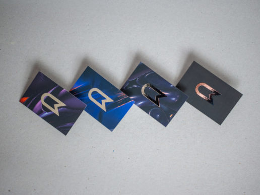
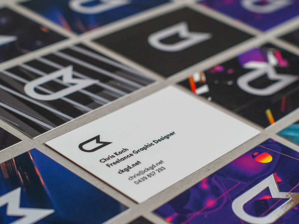
Business Card Design - Updated 2020
Think print is dead? Think again! I've updated my business cards for 2020, and I thought I'd show you what I've come up with. The aim, for me, is to hand these out locally to friends, family and prospective clients in and around Melbourne. And, just to make things interesting, I've done them a little differently this time.
Business Cards of the past
I've had business cards in the past – many times. I've run out of them, had too many, changed the design (and size) of them, and so on. But, that's the great thing about business cards is that they're meant to be disposable. Hand them out, promote yourself, show your business or service off. They're designed to be a marketing tool and, yes, I still hand them out to this very day with some great feedback. I tend to opt for high quality, custom cards, because I think it's quality over quantity. However, that's more my way of marketing my business. Every business is different. I've decided to make a few changes to my cards for 2020 to further create a talking point yet, most importantly, be a great keepsake for potential clients. Should you leave with a point of contact, or just leave? I know what I'd rather!
So, what have I changed for 2020?
This year, what I've done is create my logo in silver foil. Why? I think it's a bit of brand evolution for me, a little bit more daring and playful. It's a great talking point too – people who've viewed them have already tilted the card to see the different light that it reflects. I'm not saying that a foil, whether it be silver or gold, is a must (I have matte black business cards too) but it certainly adds an extra interest to the card, especially considering that 9 of the 10 variations have abstract art that I've made featured on the card.
What I've retained is the heavy, high GSM stock of the card. They feel absolutely incredible. Soft, yet very strong and durable. And, to compliment (or contrast, I should say) the silver foil of my company logo, I've gone for a matte finish.

Why have I changed my business cards this year (2020)?
The reason why I've got so many variations for the cards, is because it's 2020 (new year, new me, etc) but secretly because the viewer will often get to choose the card they like the best. I think it's good to have choice, and it's also great to have feedback on your work all at the same time. But because my business cards are such a talking point, it encourages conversation. It allows me to explain what I've created on the card, why I've done it a certain way, and so on. Everyone is talking digital, and don't get me wrong, digital is great. However, print genuinely card get people talking. My new business cards are an example of that.

I love the silver foil I've used on my new business cards. They always look different, they're unique and, because people aren't using business cards as much any more (why not?!), they're even more of a talking point than they were in the past.
So, if you've had business cards in the past and you think – yes! This year, 2020, I need new business cards, then lets hear from you and make it happen.
Feel free to add any feedback about the cards in the comment section below, because as always, I'd love to hear your feedback about them.
New Logo and Website - A Graphical Insight
New Logo and Website - A Graphical Insight
With my brand new website and logo now live, I thought it would be nice to show them both off in a graphical visual representation. This series of images allows you to see a snapshot of my personal logo design process, history of my logotype, concepts and ideas and web development.
I believe my new CK logo is an evolution of my previous logo, which is what I set out to be the case right from the beginning. The change was one, I felt, I had to make. I want to take my business in a slightly different direction and have a somewhat fresh start. The new logo is far more brandable, a bit less style specific and appeals to a wider target audience than the existing one did. As much as I liked my existing logo, I didn’t feel like I could achieve this. Furthermore, it was important for the design of the logo to be relatable and relevant to my existing design style.
Visually, I wanted it to be accurate. I considered a lot of things such as angles, line weight, visual balance and complexity. Whilst I executed a wide range of different styles, I was the most happy with this particular concept as it felt like it was me.
I’m really happy with the way its turned out and I’m super excited to start using it and adapting it to different things.
You’re welcome to ask any questions you might have about the logo design process or branding in the comments section below!


