Origin – Herbs and Spices Packaging Design Melbourne
Project Details:
Client:
Origin
Year:
2019
Tasks:
Logo and packaging design for start-up herbs and spices brand
Start-up food and beverage brand needs impactful packaging and design from the get-go.
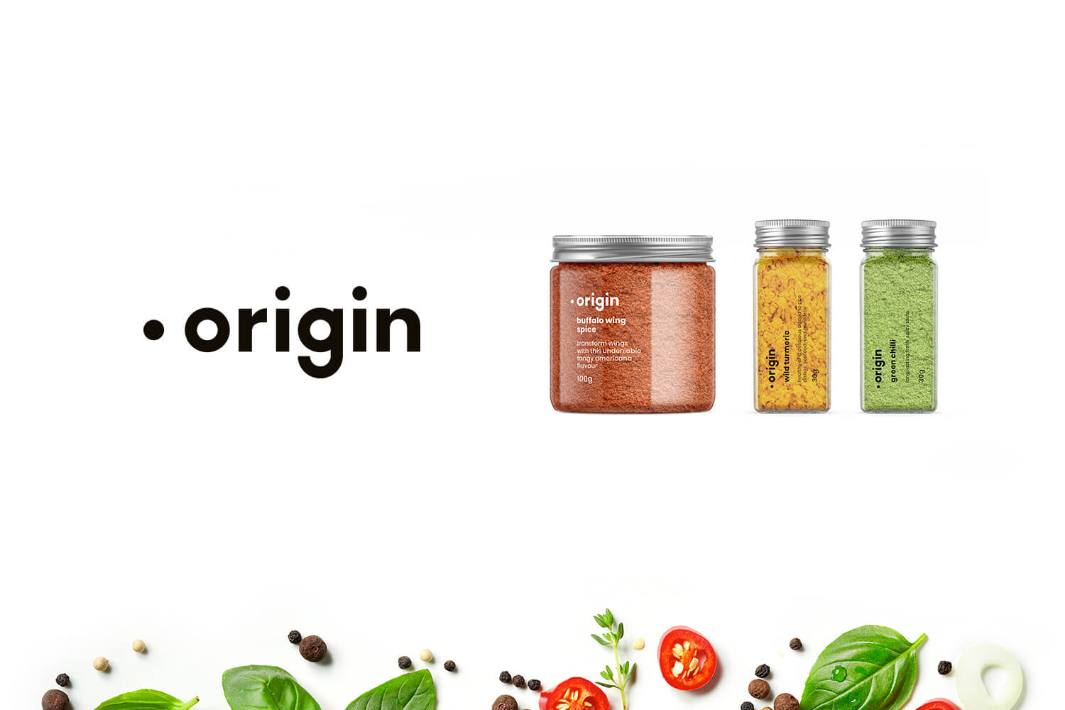
Logo and packaging for Melbourne based company, Origin They’re a new herbs and spices company in the food and beverage sector. They aim to sell as a premium product, sourcing their produce from around the world. It was important to portray the company as a premium brand through their logo design, packaging and branding.
Logo animation for Origin Herbs & Spices
Origin is a brand new Melbourne company requiring logo design and packaging
The Origin logo holds importance, particularly for the product label with it’s aim to be a staple on a kitchen bench and on display. So, the logo needs to be unoffensive, fitting for many décors and also memorable. By sourcing their produce internationally, my thought behind the logo was that the dot to the left of the type covers a few different theories. The most relatable might be the simplicity of a dot as an original point for the text / brand to the right, almost like a location marker on a map. I also felt like it could be portrayed as a space scene, where the dot is the moon and the ‘o’ is the Earth, signifying the ‘origin’.
Implementing an aesthetic into the Origin brand has allowed it to shine on the kitchen bench or pantry
Premium packaging design needs to be considered and appealing to the consumer
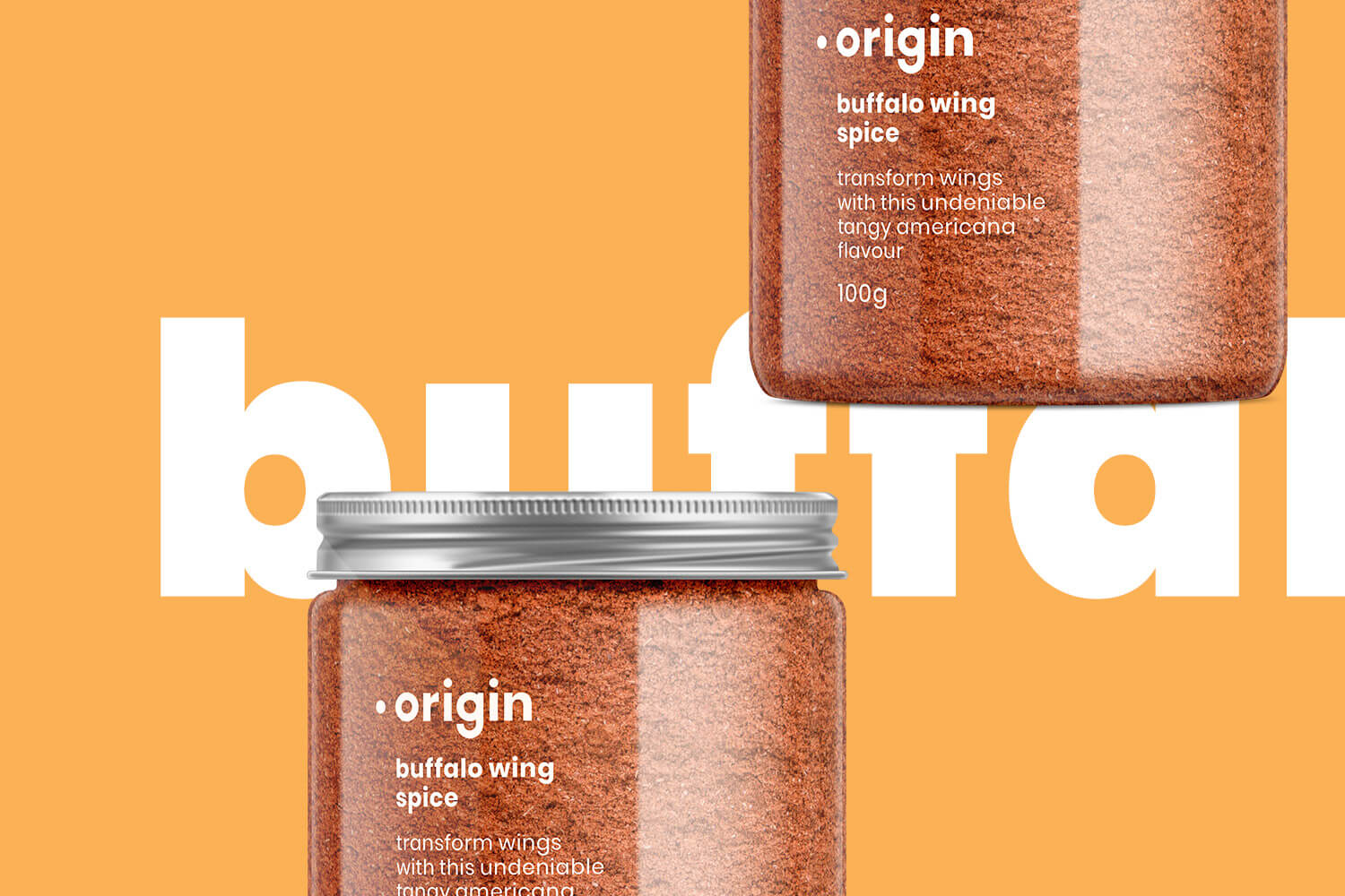
In regards to the packaging, keeping it clean was a priority of both the client and myself. It influences the premium nature of the product, in a jar that is also clean and minimal.
Plenty of thought went into the company logo and branding of the company, a style guide was created to outline the colour scheme, logo treatment and placement of product names.
Have you outgrown your branding?
Time to launch into the next phase (or, if you're just starting, that's fine too)!


