The dental industry is flooded with logos, most of which don’t actually cater to the correct target audience. From a generic tooth, to a cheesy smile. From aggressive screw features to a lack of refinement. Dentists should be looking at logo design which appeals to their target demographic, rather than push them away.
You’re about to see logo designs in the dental industry, which you maybe haven’t seen before, but they’re so common that you’ve probably seen one close.
As a person who’s nervous about the dentist, I always wonder why they don’t appear more refined, and hit the everyday person with a better approach.
You’ve seen the tooth symbol. It’s absolutely everywhere. Lets have a look at the symbol below and assess what is good (and bad) about this approach:
Dentist logo – Tooth symbol
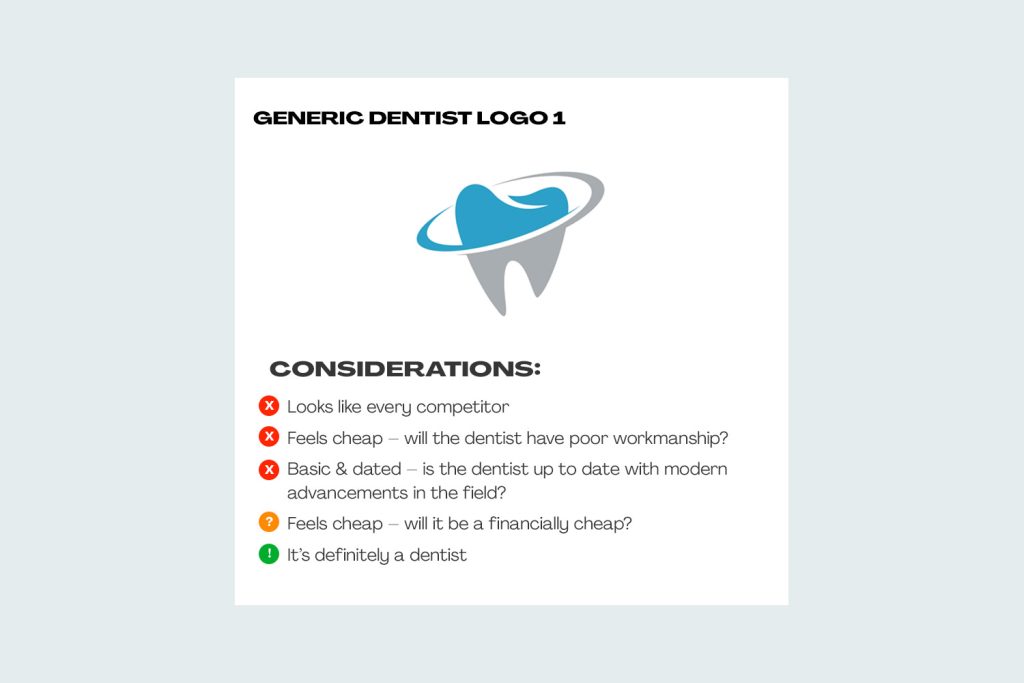
Ahhh, the generic tooth symbol for a dentist logo. Yep, perfect, the tooth is exactly what a dentist will work on for a customer. So, the great thing is that the tooth is instantly recognisable.
Unfortauntely, there’s not too many other pros for this specifically styled tooth symbol.
Here’s some cons to a tooth symbol logo:
- The tooth (as shown) looks incredibly generic, from the colours to the execution of the symbol.
- By looking like your competition, you appear the same as all other dentists. Is this true? Is your personality the same? Are you more caring, or cater to a different audience than other dentists? Probably – so lets make it look (and feel) that way
- The style of the tooth symbol in the logo above appears old-fashioned. This could be interpreted as having old, worn out, technqiues in a dated dental chair
There’s a design cue for having a cheaper looking symbol though, which is that the job might be financially cheap. And, for some people that might be the appeal.
Dentist logo – Tooth symbol (but with added details)
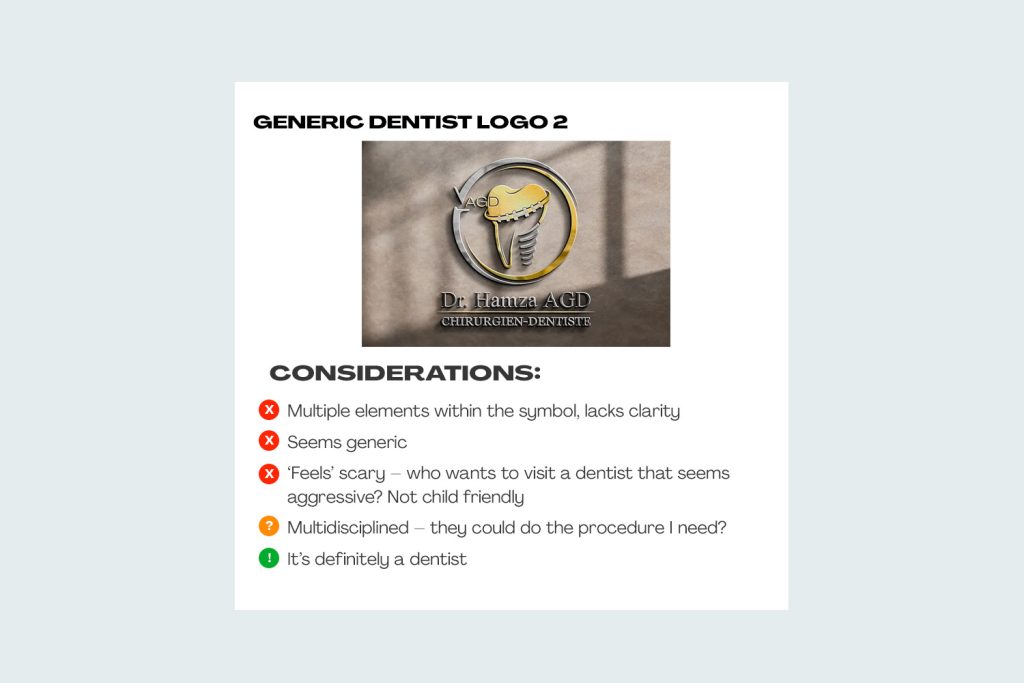
Others might choose to try and make their dentist logo feel more premium, or try and show further offerings instead of just a tooth. If you haven’t had a crown down, or had a ‘the drill’ used in your mouth, then you’d certainly have heard about how nerve-wracking they can be.
However, why would you choose to illustrate negatives in your symbol? Surely the thought of showing procedures in your symbol (yes, we know you can do it) is off-putting.
And, some cons for this particularly surgically orientated dentist logo:
- The symbol feels aggressive, somewhat scary and with lots of different ‘features’ on the tooth, has an invasive feel
- Why show negatively corrolated aspects in your symbol? Surely, that removes any approachability towards your practice
- The symbol above has so many elements in the logo that it feels cluttered. You don’t feel free, open and without pressure as a customer
- The symbol and execution of the design looks tacky. Customers who are expecting a high quality job aren’t being sold that story with this symbol style
Dentist logo – smile / teeth
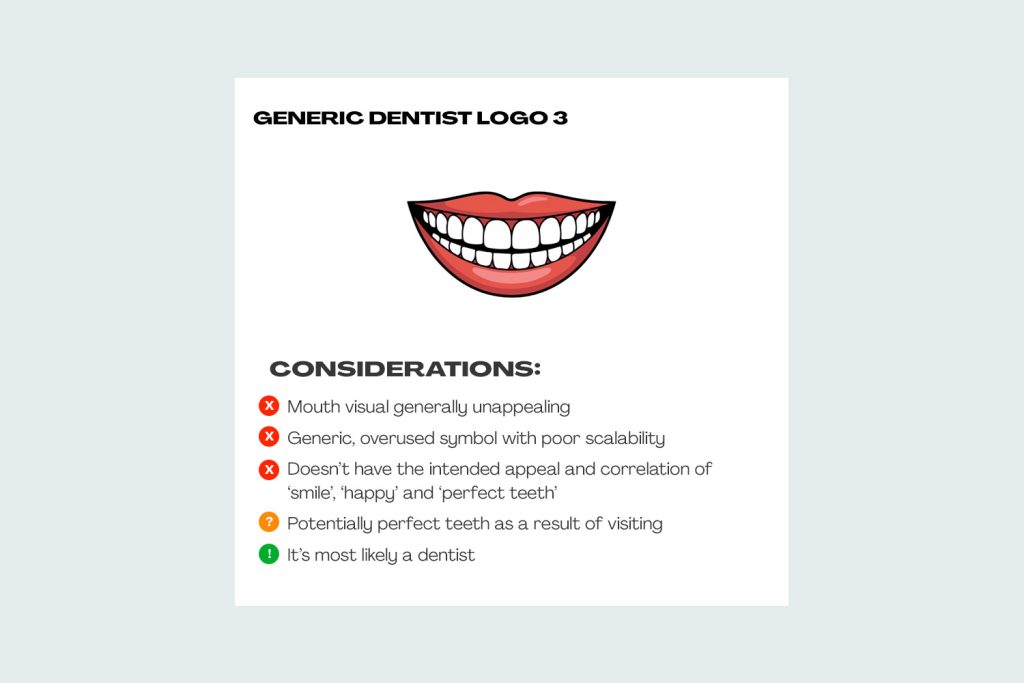
I see this example in dentist logos a lot, where they’ll show an entire mouth, with a smile, demonstrating perceived perfection.
The thing is, this ‘perfection’ isn’t often viewed as such by a potential customer – mouth care, yes. It comes across as being or feeling creepy. So, it’s important (again) for a dentist to be aware of the care it should be showing towards potential customers.
Finally, here are some negatives for the typical ‘smile’ symbol:
- A smile isn’t been seen, nor is perfection. The potential customer is being sold ‘dental care’
- This type of smile symbol isn’t customer friendly for children or people afraid of the dentist
- It’s not demonstrating a high level of quality, contrary to the belief
What makes an approachable, friendly yet high quality dentist logo?
It can be tricky to execute a logo for dentists, because of how well-renowned a tooth symbol is in the industry. But, lets not forget, this visual (as per the example 1 above) is very widely used in the industry.
My tips for creating an approachable logo for a dentist, that steal screams high quality, refined, knowledgable is:
Tips for a friendly, highly-approachable logo for a dentist include:
- First things first is to also consider your target demographic and socio-economic group. What is the area and location like where your practice is? Do they have expendable income?
- Within your target demographic, do you want to appeal to children or nervous patients? Considering them and designing your brand around comfort, ease of use, approachability is so important
- Colours tell a big story – how does this influence the psychology of your potential customers?
- You’re the professional dentist, and people require your skill and expertise. Your logo should appear like thats the case
- The location of your dental practice should definitely be considered
- Is there a team of dentists at the practice, or is it a solo venture?
That would be my list to start – there’s a lot of considerations, but with the right answers comes a long way to a successful logo design for a dentist or dental practice.
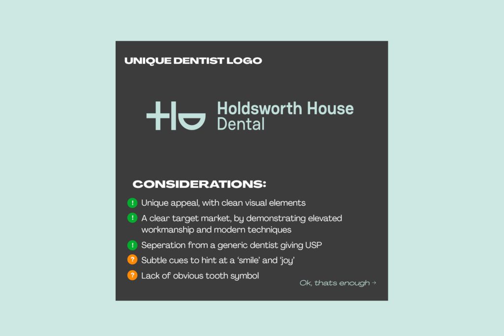
Above is a list of considerations I had when creating the Holdsworth House Dental logo, for a practice based in Sydney, Australia.