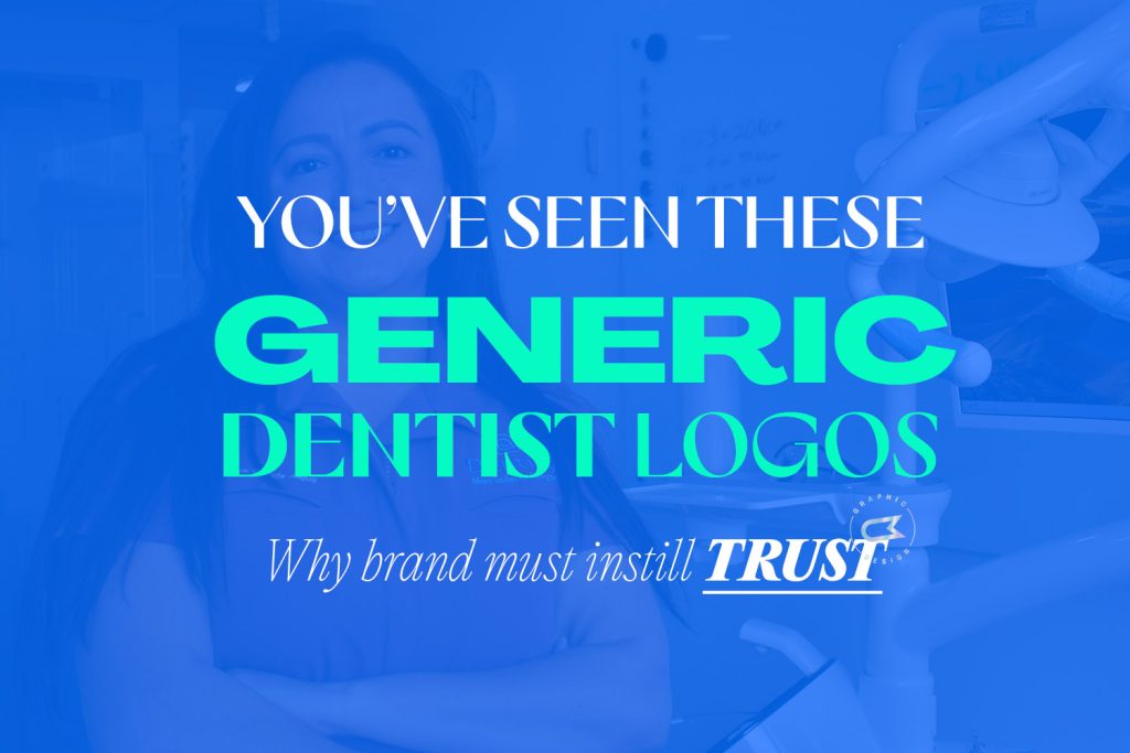
What makes a good fitness logo design?
A good fitness logo can be hard to achieve. Lets face it, there’s a lot of competition around in the fitness industry and it can be easy to get lost in a sea full of fitness logos. Inspiration for fitness logos are easy to find, but there’s a lot of poor-quality fitness related logos out there. So, lets dive straight in and find out what makes a good fitness logo.
Target a specific audience
So, your fitness business needs a logo, but what should it be? How much does a logo design cost? Knowing who you want to target with your fitness brand makes all the difference. It’s extremely common for companies to want to target a large audience to their facility, males and females of all ages is extremely common. However, if we narrow down who your business wants to target more specifically, creating a logo for it can be far more effective.
We have to consider the area in which your facility is located, and the cost of visiting your fitness facility or service. Is it a cheap gym that requires a logo? Is it small group personal training that you’re trying to attract? These are good questions to ask yourself which will aid the logo design of your business. Does the studio mainly attract women, or is it that really grungy, male-dominated, strength gym that you’re operating?
We can quickly discover who the target audience is, with a bit of thought. And, then, what the age group of the fitness business is, too. All of these elements equate to what the logo design for your fitness business should equate to.
Small fitness studio logo design
A fitness studio that’s small, intimate and personable should have a logo design that represents those features. If the class sizes are small, then creating a logo to represent a fitness facility that is close, warm and friendly should be represented in the logo design.
A consideration should also be the location of the small fitness studio, whether it’s in trendy South Yarra or Prahran, or in the outer suburbs of Melbourne, for example, would make a big difference to the target demographic of the studio, and potential the cost of membership / price per session.
Franchise fitness logo design
A logo for a gym franchise is a little bit different to a small fitness studio. A consideration comes more about location and cost of use. This should be represented in the logo design for a franchise fitness business. Can the member use a key fob and go to multiple fitness facilities, like Fitness First, Anytime Fitness, and so on? Are the studios located in inner Melbourne, or are they scattered throughout Australia?
Gym logo design
An independent gym logo blends the above two features together. It might be the fact that the gym is large (or small), cheap (or expensive) and location/s are important to consider too. Again, to atrget the right audience with your gym logo design is critical to its success. It may also be an online fitness store logo design that you're after, similar to World Fitness Australia. The same rules tend to apply for these, too!
Personal trainer logo design
When I consider personal trainer logo designs, I think the personality of the trainer is a bigger factor. The logo I designed for Apex Training gives a great insight in to my thoughts and process and you can also read about their logo design case study. It might be their specific training style that has a higher consideration, along with location, gender and potential clientele.
It’s extremely important for a fitness logo to be relevant to the target audience of the gym, facility, clients and demographic of their clients and prospective members. To have the right logo design is one thing, but branding is also extremely important to really capture the audience you want to.
Creating Custom Health Care Logo Designs
I've been lucky enough to work with a few Health Care companies now, and created a lot of logos for the medical field. And, in my 10 years of Freelance Graphic Design experience, I've seen a lot of old logos which are in desperate need of a redesign, and also some new companies and services who don't even have a logo to start with. All the amazing work that the Health Care sector has been doing to start 2020 has given them (deserving) more recognition in light of COVID-19. Having completed hundreds of custom logo designs, I know a thing or two when it comes to successful logo design for a company in Health Care.
Before and After of the Medical Informatics Logo I designed.
Colour choices are important
The use of colour in the medical field is so important. Colour can invoke emotion to the viewer, so careful selection of colour palette is important. Health Care is a critical sector to get right, because the patients feeling towards the service is paramount to their trust. We know that health care, especially when it comes to medical and operations, is representitive of the colour red. However, is that the best colour to portray the business? This is a case-by-case scenario, of course.
Blue has been, and always will be a colour of choice in the medical field. For businesses in health care, when it comes to logo design, blue is a feeling if calm and cooling (the situation, environment, etc) of the subconscious mind.
A concept for Paul Manohar Urology, showing a part of the kidney function.
Symbol design in logos for medical practitioners
It can often be requested that a needle, crutches, bed and other medical tools or devices make good a good symbol for a logo. Yes, they identify in a very stereotypical way the service, but how does the patient feel when they see the logo? Styling the symbol, along with colour, can offset the feeling, but the majority of the time, especially if very stereotypical, the patient may feel sensitive. So, it's important to be careful with symbol design for a logo for the medical field.

Choosing a font for health care logos
Similar to colour and symbol in a logo design, the font (or more specifically typeface), is an important choice. The typeface of choice usually reflects how professional and reliable the service is. So, typeface choice give fulfill part of the confidence element of your service which may allow the patient to get in contact with your service.
Designing custom logos for the health care industry is important. Just like the medical service itself, and the patient having trust in the doctor, nurse, practice (and so-on) on a personal level, the logo and branding for a business in this field can also be a true reflection on how much they value the service they provide and the feelings of their customer. I've seen success in the logos I've created for practitioners and health care providers, which is so great to see, and all their hard work, not only during COVID-19, but always, shouldn't go unnoticed.
How COVID-19 / Coronavirus is Influencing Marketing and Design
What a world, hey? Hasn't everything changed in the last few months, with the spread of COVID-19 / Coronavirus, companies around the world are changing their marketing due to the pandemic. Whether it's companies closing their doors, or struggling to survive, others like supermarkets are generally thriving and struggling to keep their shelves stocked with essential items.
However, a few big companies have tried to take on innovative, new ways of marketing through the use of design and social media. Social distancing was a word not too common 3-4 months ago, and now it's a household term, known all around the world. Whether it's to keep 1.5m metres away, or 6 feet, whatever measuring system you'd like to use, it's so important to control the spread of the virus and reduce the risk.
Lets have a look at a few companies and how they've used design to encourage social distancing due to COVID-19.
Audi Social Distancing Logo
Audi have spread their rings, usually joined, to demonstrate social distancing in their logo. They're encouraging people to 'keep their distance' with a message and video from one of the biggest automotive brands in the world. Simple, effective and animated, moving the rings apart from each other clearly gets the message across to their viewers.
Mercedes Benz 3 Pointed Star Social Distancing Logo
As you continue through this article, you'll notice a bit of a trend – auto makers. Anyway, Mercedes Benz joined in the social distancing logo trend for COVID-19 by altering their three pointed star logo, moving the points away from the outer ring. They encouraged people to 'stay at home' to stop the spread of the deadly virus.
Volkswagen's New Logo Demonstrates Social Distancing
Volkswagen recently updated their logo and it hasn't taken long for their designers to start playing around with it in creative ways. Like Audi and Mercedes Benz above, they've "social distanced" the contents of their logo, this time separating the V from the W within the outer ring of the logo. It's perhaps not as... beautiful as the two above logos, but the message still gets across, and further thanking people to keep their social distance through this time of crisis.
McDonald's Arches Separate To Demonstrate Social Distancing
The last logo I've spotted which has encouraged social distancing during COVID-19 is Brazil's alteration to the McDonalds logo. By separating the famous golden arches of the McDonalds symbol, social distancing surrounding Coronavirus is encouraged. It's hugely strange to see such an iconic logo altered in such a way, and has also come under some criticism in the media for doing so.
I'll certainly be keeping an eye out for any other logos, marketing media and advertising that encourages social distancing during the time of Coronavirus. It sure is a changed world, and safety is paramount in this time. The message that Audi, Mercedes Benz, Volkswagen and McDonalds have provided is a reminder with good intention, but also gives their companies exposure in what is not only a health crisis but an economical one too.
6 Rebrands of 2019 that got the Design Community Talking
I know, I know it’s 2020 but I’ve been looking back on logo redesigns of last year, and I really wanted to write an article about them. We had some big ones (and will have more redesigns in 2020 no doubt) including Firefox, Staples and Zara to name a few. I thought I’d write a quick article to discuss some of the best from 2019. Leave a comment below and mention your favourite (or not so favourite, that’s OK too!) of last year.
1. Mozilla Firefox

A simplification was undertaken at Mozilla for their Firefox logo. It’s certainly got more modern traits of a logo, with elegant lines and some striking new colours within the symbol itself. A major change in their logotype is also a key feature of their revised logo. It has to be said, the iconic fox seems to be made way for more of a ‘swoosh’ shape. All in all, I think this is a positive rebrand and a much more sophisticated look over.
2. Zara

This Spanish apparel giant had quite a lot of people talking with their brand new wordmark. Four letters, and an already very stylish logo – what could go wrong? Well, designers around the world hated the new kerning of letters for the revised logo, mainly because of just how much the letters overlapped each other. It’s still, to this day, has a lot of people generally hating the new Zara logo and has been very controversial. Is it readable? Perhaps – just. The elegance and class of the old logo makes this re-design, or brand evolution, a negative one.
3. Staples

Another massive retailer, this time Staples, went a big rebrand after it changed it 25 year old logo for a much more literal design. Now, the literal sense of the staple stands beside the world… Staples, funnily enough. The CMO Mashall Warkentin stated that the symbol “is symbol of the commitment we are making to our customers.” And, many viewers, both designers and consumers were divided about the look of the new logo.
4. Slack

The rebrand of Slack uses a simpler colour palette and is generally trying to be more refined and scalable. But, is it? Has it actually gone backwards in its evolution? Many would question the new Slack logo, where the old logo does, in fact, carry more modern web-based traits than the new logo. The colours used in the revised logo look like a bit of a mish-mash of tones and hues.
5. Android

A lot of the cues behind the revised Android logo look to be based around the Google rebrand to make it more accessible. The famous Android robot character remains, but in a much more vibrant (and visibile) green colour. But my favourite part of the new logo is the typography used in the logotype. It’s so much better than the retro looking Android type of logos gone by. And, all in all, the logo does align much closer with the Google Brand.
6. Volkswagen

A new, sleeker look for automotive company Volkswagen could be considered damage control after the company has had so much trouble with emissions scandals. However, it probably also directs itself more towards the way of an electric, more streamlined future. Automotive companies are moving towards lower emissions, cleaner more purposeful lines and Volkwagen is just another one of those companies.
Logo Design Cost & Process
The cost of a logo design varies from country to country, designer to designer and client expectation to, well, client expectation. It can be a hotly debated topic, where people often question why a logo will cost so much. Well, I’m here to try and explain the cost of a logo and give an explanation as to why I charge what I do for a logo.
The logo design process
The first thing to discuss is the process itself. It’s a multi-step process that can involve such things as research, brainstorming, sketching, comparisons, concepts and revisions. And, with so many variables, that’s part of the reason why a logo ranges in price. From the outset, I’ll say that I don’t have set prices for logo designs, but I do have ranges that I can estimate what the cost will be based on past experience.
A logo can be used in so many different places. And, before you jump on Fiverr and find the cheapest, ill-considerate designer you can find, think about the cost of running a business and how much a logo actually means to the business. Do you ever look at company logos when you visit a website? In a shopping centre? On products? Do you make snap decisions on whether or not you’ll buy that product based on their logo? You might actually be surprised how many people, yourself included, make decisions on what jam to buy, or what gym to join or what clothes to wear based on their logo design alone.
So, a logo can live in many different places; online, digitally, printed on business cards or shop walls, marketing material and so on. And all those variations can result is multiple logos being needed to be created. Logo file formats are usually in raster or vector.
Raster vs Vector Logos – What's the difference?
Raster files are measured in DPI (dots per inch) and have a file extension such as .jpg, .gif or .png. These files are based on pixels, which are set dimensions. So, increasing or decreasing the size may result in pixilation or distortion. That is because the computer is working out where to fill in the pixels.
Vector files can be scaled to any size you can imagine without losing quality, which is great for printing (think billboards) all the way down to social media posts and email signatures. They can also be opened, edited, and saved in different applications, and have a file extension of .ai, .eps, .svg or .pdf. But don’t be fooled, some people place raster files inside vector files – these will not act the same way.
Colour variations of Logos
It should also be noted that logos need to be visible as much as possible. Their usage can vary too, so it’s important to have the logo designed in different colour combinations to make this possible. You’ll generally need light, dark, full colour and monochrome variations of the logo. I like to supply black and white logos for the times when a job might also be set in black and white.
We’ve also got colour options such as RGB (for digital logos), CMYK (for printed logos) and Pantone logos for spot colour jobs.

Costs / Packages of logos
Agencies can charge quite a lot for a logo design. The reason is because of their large overheads and staff that they have to pay, which is fair enough. I generally don’t charge close to what an agency charges which can be between $5,000 - $10,000. For a business, this can be a substantial outlay especially if you’re a start-up.
I tend to charge less, because whilst I have the experience of an Art Director, I still call myself a Senior Freelance Graphic Designer, because I feel like that’s a more suitable title for me. In fact, I’ve had clients who have come from having a logo developed by an agency, not been happy with their job and come to me to get a higher quality logo at a cheaper price.
My process and costs
I generally ask for a 50% up-front deposit to commence the logo design process. This allows me to have confidence in the client, and the client has confidence that project is underway. I’ll always ask the client information about their business. I’m invested in problem solving the situation to create, what I believe, is the best solution for the client.
So, what is the best solution? Well, you may have read in my other articles that targeting a specific socio-economic group and target demographic is the most important thing. This is because you want the logo and brand to appeal to a specific person – the person you want to sell to. This could be a wealthy 65 year old male from Brighton in Melbourne who loves expensive cars. Or, it could be a uni student just scraping through with rent each week and just wants the cheapest gym in town. Either way, your company has a market it wants to hit, and a logo can be massive in targeting the correct crowd.

So, analysing your business with key information is critical. Are you big, are you small, have you been around for 30 years, are you close to the beach, who’s your competition, your market, where are you selling, and so on. So many answers do I want to pack into your logo to design it the correct way. It’s a very psychological and meaningful process that deserves consideration.
Logo concepts and revisions
I generally create three logo concepts first up. I think it’s important to suss out which direction the company can go in, and which of the critical information that I spoke about above, needs to speak the loudest (in the logo). I ask for feedback from the client, to see if my analysis is correct. Majority of the time it isn’t too far off the pace, and a good brief from the client usually makes this the case.
Some designers give a set amount of revisions like 2 or 3, and price their logo based on that. I don’t agree with that process, because if a logo fits after the first revision, then that’s a resolution. If it takes 4 or 5 passes, then perhaps the brief, or my interpretation of the brief, isn’t correct. That doesn’t mean it’s job over, so it’s no stress, it just means that further clarification may be needed.

All of these variables I talk about are reasons why I don’t have a set-in-stone cost. However generally a logo for a small business will cost between $1,500 - $3,000 which is substantially less than an agency. And, I like to think that I put more care into a logo than an agency would too (but I’m bias)! For mid-sized companies, or companies with more exposure, this cost can be more. Somewhere between $2,500 - $4,000.
So, if you’re thinking about getting a logo design created, hopefully this article has helped. I’d be more than happy to discuss your business and requirements with you and give you a more accurate figure. I’ve done a lot of logos now, backed with 10 years of experience, that I have a good idea as to how much your logo could cost.
All the best on your logo making journey!
Supplement Label Designs and Requirements
Now that I’ve designed for quite a few supplement companies, I’ve got a good grasp on what’s required for supplement label design, how it can be applied on packaging, marketing features and elements, hitting key fitness demographics, and so on. Supplement design, whether it be whey protein powder, a fat burner, casein, (the list goes on doesn’t it?!), is a super competitive industry. And, the clients I’ve had requesting their brand on supplement labels has ranged from start-up entrepreneurs, hobbyist, personal trainers, to larger, more established companies.
Design Requirements
First things first, you need to know what type of products you want to sell. As I mentioned, (and if you’re reading this article you’re bound to be interested in all things supplements), there’s so many different types of supplements in the fitness industry. So, knowing what you want to sell is critical, because more often than not, that will dictate the size of the packaging required. Furthermore, the quantities of protein (for example) generally comes in quite a number of different sizes, in different types of packaging. Some are zip locked, some are in tubs and some in sachets.
Nutrition Information and labels
When a food product is sold to the public, generally a nutrition label is required to go on the product packaging or label. I’m specifically going to talk about Australia and the United States here, and say that both countries do require this information.
Even stylistically, the nutrition information needs to be designed in a legible way. This can be quite complicated, so please refer to some of these websites which may help:
Australia Food Labelling
Food Standards Australia Nutrition Information Panels https://www.foodstandards.gov.au/consumer/labelling/panels/Pages/default.aspx
Food Standards Australia Nutrition Information User Guide https://www.foodstandards.gov.au/code/userguide/Documents/Userguide_Prescribed%20Nutrition%20Information%20Nov%2013%20Dec%202013.pdf
Australia Made Logo Use https://www.australianmade.com.au/for-business/using-the-logo/
United States Food Labeling
FDA Dietary Supplement Labeling Guide https://www.fda.gov/food/dietary-supplements-guidance-documents-regulatory-information/dietary-supplement-labeling-guide
FDA Nutrition Labeling https://www.fda.gov/food/dietary-supplements-guidance-documents-regulatory-information/dietary-supplement-labeling-guide-chapter-iv-nutrition-labeling
Often the Nutrition Information will be supplied to me by the client. It is their duty to supply the correct information and guidelines for me to complete.
Using a Template Maker
A template maker for supplement design is often a really cheap, inefficient way of doing business. Calculating the costs involved in using a template maker, how often it’s been used by other companies all around the world, legalities, specification sizes and so on, is extremely risky. It would also be a time where, if you find yourself going down this route in business (in general), you might need to ask if you can afford to run a business. A template maker, whilst useful for some things, would be extremely risky.
Let’s talk about custom supplement label design
Ok, onto the fun stuff! Custom supplement label design, something I specialise in, is what I know best. We have some key areas to focus on here, and they include logo design, software, target demographic, style, and printing types / substrates.
Logo Design for Supplement Companies
I’ll talk about target demographics a little bit later on in the article, but logo design is critical to the success of a brand. So much design aesthetic stems from a logo design. There’s so much consideration that needs to take place and if you’re an experienced Graphic Designer then you’d recognise what has the ability to work and what doesn’t. So, please read further down the article where I talk about appealing to a target audience, because that pertains to logo design too.
One of my favourite logos I’ve created is for Nitracore, a more hardcore style supplement brand. I created custom type for the company specifically directed to appeal to their target audience.
I’ve also created a logo for Megathom, Argyle Nutrition, Monster Performance, Primo Performance and a few more companies.
Software to design supplement labels
Generally, labels I design for clients are created in Adobe Illustrator, Adobe InDesign or Adobe Photoshop. However, it’s usually a combination of two or three of those. Consideration of size of label, resources (like photos, the company logo, and so on), and quantity are assessed. Adobe Illustrator is great for label design (and company logo design for that matter), because of its sizing (un)restrictions. The majority of print based work I create for labels is created in Illustrator. InDesign is really useful for larger quantities of work, so if you have a lot of labels to be created in many variations, this could be my choice of software. Photoshop is generally better to make edits to photos and photo manipulation, mocking up products and so on.
Speaking of mocking up products, this is something a lot of clients end up requesting for their fitness business. To show photo quality renders to customers, without the use of actually hiring a photographer, the perfect setting, and so on, is so appealing. You can also rotate the product on different angles, so showing it on a gym floor, or presenting it in a nice, natural (or in some cases, really abstract and stylistic ways) is so engaging. I generally use Cinema 4D – one of the most powerful 3D rendering programs in the world – to create the product renders.
Designing appealing labels for customers
Supplement labels are no different to most other print-based graphic design work. Considerations for who your target audience should be at the forefront of your mind. For me, that’s certainly the case. Identifying who your customer is could involve the following:
- Location of the customer. This could be as specific as your local area, state, country, multiple countries and so on. Even with the internet, it’s important to realise who are typically visiting your website.
- Physical abilities of your customer. Are they just starting out in fitness? Is it their hobby? Are they semi-professional? Professional athletes?
- Age of your customer. Younger demographic? Older?
- Gender specific product or a skew towards a certain gender.
- Your main competition. Are their labels similar to yours? How can you differentiate yourself from the competition?
- Cost of your product relative to the competition. This is so important, because often consumers will look at your product side by side with another, similar product. If their protein powder looks and feels more expensive, that may mean that they opt for their product, or end up using yours because it in fact looks and feels cheaper.
Often clients will approach me and state that they want their product to appeal to everyone. And yes, that would be fantastic! However, it’s never the case.
If we look at a company like Optimum Nutrition, for example, who are iconic with their label designs, they’ve made their labels appear expensive, the typography used demonstrates their product is more geared towards hobby to semi-professional athletes, at a mid-range demographic and a slight skew towards males. With all of that considered, the price point for a brand like Optimum Nutrition is generally more expensive, and that’s because of their more luxurious look. Now, they also have the backing of reputation, too.
Supplement Packaging, Bottles, Sachets (etc).
After the logo and supplement label is designed, often clients will print their labels onto tubs, bottles and sachets depending on the sizes of their products. There’s such a wide range of options in regards to printing.
A few options could be:
- Matte / Glossy Paper
- Silver Metallic Paper, sometimes with a white underprint.
- White Film BOPP Polypropylene which is great because it’s waterproof and tearproof
- Clear Film BOPP Polypropylene
- Chrome Film BOPP Polypropylene
There’s a range of costs involved in regards to quantities, types of print, quality, paper and so on. They’re best discussed on a case-by-case situation.
So that’s about all for supplement label design in terms of a general guide. I hope it’s helped give you a better understanding of what’s required. Feel free to contact me if you have any questions!
Top Company Logo Redesigns of 2016
2016 was a big year for logo redesigns with many companies changing their visual identity to something new and more visually exciting. Being such a signficant part of company's brand, it generally requires all collateral to then be changed, too. So, redesigning a logo can be difficult in order to balance traditional elements of the company with an evolution or new direction that the company is trying to portray.
These company's had mixed reviews, with some copping far more criticism than others. I'd love to know your thoughts on which you believe are successful or not!
Mastercard
Generally, the Mastercard logo redesign was positively recieved. The change in logotype, switching from an italicized, drop shadowed sans-serif look, has allowed them to fit more in-line with current trends. With the use of FF Mark now incorporated in the logo, the round, overlapping circles now have a complimentry typeface using the same geometric features. It would be interesting to see if they could have used an uppercase "M" to help balance with the lowercase "d" for some added symmetry. The thing I love most about the new logo is how brandable it is.
Kodak
Kodak's previous logo was considered a big change for the company at the time, where they went to a logotype only logo, removing the camera-shutter icon. The new logo has so many traits of the brands previous logos, that it almost feels like they've acknowledged that what they had previously, was so iconic. They have modernised the logo, with a modern typeface, but retained the flat two-colour look that they've always had. The new logo has been recieved very well, and an often frowned-upon stacked type aesthetic seems to work.
Changing from it's retro camera logo to a multi-colour gradient was a big change for the photo-sharing mobile app. Instagram retained the view finder, but created a more vibrant, modern logo. Initially the new icon was received very poorly, with a lot of people disliking it. However, I feel that as more time passes, the majority of those would be changing their views. I feel as though it was a positive change, but I would have liked to have seen the light 'flash' gradient reversed. The only reason I believe the light source is at the bottom is for balance.
Deliveroo
A substantial change compared to the other updated logos in this list, Deliveroo retained their corporate colours, but totally changed everything about their type and symbol. From uppercase to lowercase and a full bodied kangaroo to a head, they've opted for a bolder more simple identity. It's important to note the use of the logo, often seen on bike couriers, their logo needs to be quickly identified and simple. So, a 'clip art' type look, I feel, works for them. The quirky looking kangaroo aims a more specific, younger target audience.
Premier League
The Englush Premier League have always had a soccer ball in their symbol and a very royal looking logo overall. This redesign removes the ball (and the lions body) to create a more modern and dare I say trendy looking logo. This really comes out especially in it's application during a match. And, the way it's used is very different to other sports around the world, so it is trendsetting for a sporting logo. Created by the agency who did AirBnb's latest logo, it does have some evolution with a proud, forward facing.. face. One thing to note is the colour palette which has a feeling of being a strange choice, changing from royal to something a bit more dispirited.
Uber
Quite a radical change for ride sharing company Uber, they've gone with something stylistically very different. Gone goes the professional and somewhat high-end looking logo to something a lot more geometric and introducing more colour. Uber has described their logo as inspired by the "bit" and the "atom" which are both the foundation of technology and the universe. The good thing about the redesign is that it does take away from that black car, private ride-sharing feeling to something a bit more broad and general.
That wraps up some of the significant brand changes of 2016. Other notable entries were Taco Bell, Dell, Qantas, Subway and Pandora.