
Top 10 Google Fonts for 2023
After two years with such interest in the top Google Fonts of 2021 and Google Fonts of 2022, I feel as though this is a trend that is going to continue. So, I can't wait to show you the top fonts I've identified on Google Fonts to be an absolute trend for 2023! Will this year be the year of more transition and more risk with Google Fonts, or will we see the same fonts (Roboto, Open Sans – I'm looking at you!) time and time again? No doubt, these are solid fonts, but perhaps it's time for something fresh.
This year is different though – we have a bonus font to check out! Scroll down to the bottom to find out which font is the secret bonus font for 2023.
All the fonts on this list are available on Google Fonts, and could be great for your next web or print based design. As usual, I'll post some more common fonts, some which I think could be a great alternative / rarity, and others which are just great fun. However, these are all fonts you will eventually see on your screens in 2023, so TAKE NOTE! Be aware that these fonts are available on Google Fonts ready for you to use!
Lets take a look at some of the best Google Fonts for 2023:

What's great about all these fonts is that they all have different characteristics. Some are modern, some bold, some sans-serif, serif, variable – the list goes on. And, that's what is great about typography is how different fonts can be used to really personalise and individualise projects.
Here's my top 10 Google Fonts for 2023.
1. Unbounded
Unbounded is one of those great, highly variable wide fonts that is just so versitle and on trend at the moment. The glyphs / punctuation are great fun. Once again NaN (creator of Rubik) has hit a font right out of the park. The bolder the better for this font, I think!
2. Cormorant Garamond

Lets change direction, and take a look at this beautiful serif font in Cormorant Garamond. It should be noted that this font is inspired by Garamond, but none of the characters are traced / copied. It's all created, from hand, with Garamond being the inspiration by the fypeface. Looking at the italics, thats the font variation that interests me the most. You could really build a brand with a lot of credibility, class and dignitiy with this typeface.
3. Gothic A1

Gothic A1 looks to be that narrow, rounded font that has easy reability yet also comes across as a great blend between class / friendliness. Setting the tone with this font could be use in a headline, with a call to action, or heading text within a document. The narrow structure of the type allows for great use in tighter spaces.
4. Jura

Jura is one of those fonts for a very specific use case. Typically you'd look at using this Eurostile-type font for more technology / tech / digital / sci-fi type projects that have a futuristic element to them. Of course, while this font isnt bound to those restrictions, it is a super solid sans-serif font.
5. Prata

Another very elegant font for use on Google Fonts is Prata. WIth sharp features, yet organic looking teardrops, I'd recommend mainly using this font for headings rather than paragraph text / bodycopy. Observing the thin strokes within some of the glyphs, it is clear that this is a display-size font to use. However, pairing this font with an easy-to-read font would really allow the font to work in quiite a beautiful manner.
6. Anton

If you're looking for a slab-serif condensed font, then Anton is the one for you. Great for capturing attention / use for advertising, Anton creates a sense of urgency. Once again, I'd recommend using this one more for headlines, or a short breakout, than bodycopy / paragraph text.
7. Space Grotesk

Featured in Top Google Fonts 2022, I just had to feature Space Grotesk again. It's such a nice font at a whole range of sizes. I still love the mono inspiration it has, so it can be used in a very stastical, data-driven, technology based use case. I still think it has a place in the top 10 for 2023, because of how unique it is, and when used correctly can have a whole heap of impact.
8. Comfortaa

Rounded, geometric typefaces are very popular at the moment and Comfortaa is another one to add to your list of fonts to use for 2023. It's great to use, particularly for larger sizes, but I feel as though it scales well also for moderate headings also.
9. Nanum Myeongjo

I absolutely love this font in all sizes, but for me Nanum Myeongjo reminds me of the most typical newspaper style font. It would look like absolute dynamite on a web-based, clean, statistical or factual website with news-based articles. A beautiful, warm style sans-serif font which just has to be used in 2023.
10. Abel

Another condensed font, but this one much more flat sided. Abel is great to use for headlines and posters, yet surprisingly readable at smaller sizes due to the mono-weight. Note that this font is only available in the one weight, but that shouldn't stop you from using this as a headline and pairing with another font for more versatility.
Bonus Top Google Font for 2023
Bonus: Shrikhand

Described as 'big, bold and unapologetic', I think Shrikhand is one of those fonts that screams out to you that it needs to be read. You can totally imagine this font painted on a cafe wall or a headline for both web and print. The reason why this font is a bonus font for 2023, is because it has somewhat limited use. Not only is it only available in one weight (which is fine), the target audience for this font is somewhat restrictive. If it suits your audience, then Shrikhand is going to be a great solution.
Top 10 Google Fonts for 2023
Well, there you have it. That's my list of my top 10 Google Fonts for 2023. I love this series, and it's fantastic to be able to provide it to you once again. I'd love to know what your opinions are and if there's any fonts I've left it from Google Fonts, please let me know in the comments below.

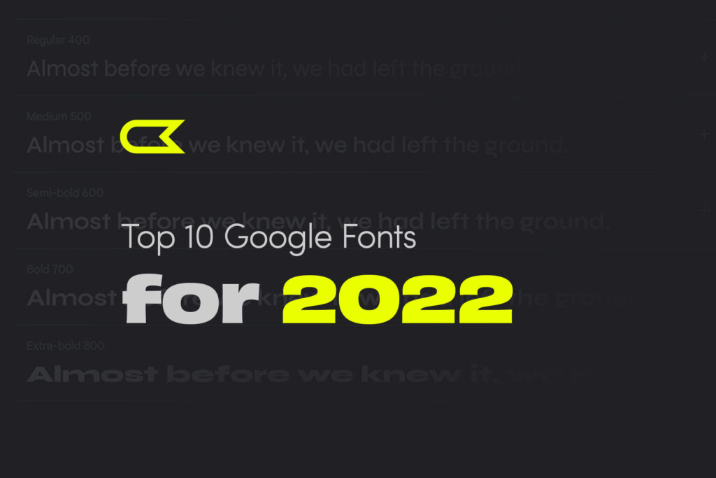
Top 10 Google Fonts for 2022
Want to see my Top 10 Google Fonts for 2023 instead?
If not, please continue!...
After such an amazing response for the top Google Fonts of 2021 post, I couldn't help but come up with some fonts I've identified on Google Fonts to be hits for 2022! You've probably been seeing new typographic trends on the internet already in 2022, where brands are really trying to re-establish themselves after a couple of difficult years.
All the fonts on this list are available on Google Fonts, and could be great for your next web or print based design. Some of these are literally hot off the press, recently added to Google Fonts, and some are tried and tested. Nevertheless, you'll be seeing these fonts used in the next year in brand new ways, which is really exciting for design in 2022. Also, luckily enough, these fonts are available on Google Fonts ready for use!
Ok, lets get straight to it!
What's great about all these fonts is that they all have different characteristics. Some are modern, some bold, some sans-serif, serif, variable – the list goes on. And, that's what is great about typography is how different fonts can be used to really personalise and individualise projects.
Here's my top 10 Google Fonts for 2022.
1. Syne
Syne Regular is the starting point of the family. It is quite an archetypal geometric sans-serif, giving the art center a practical asset for their daily use. When getting bolder, the typeface also gets wider, forcing radical graphic design choices. I can see this font being used widely on the web, but the Extra Bold variation really caught my attention.
2. Playfair Display

I listed in this my top Google Fonts for 2021, and it's still such a good looking typeface. This design lends itself to this period, and while it is not a revival of any particular design, it takes influence from the designs of John Baskerville and from ‘Scotch Roman’ designs. Being a large size design in the transitional genre, functionally and stylistically it can accompany Georgia for body text.
3. Mochiy Pop One

These lists always get flooded with the same sans-serif or serif fonts, but what about a fun, kids based website. Or, a website for dogs and puppies? Sometimes we just absolutely need to use something fun, full of personality, and suitable for a specific target audience. Well, Mochiy Pop One is new on Google Fonts and its well worth a look. It has traits of manga, magazine, movies and sign usage.
4. Poppins

Poppins is just going and going and going. It's standing the test of time for so many projects, and in 2022, it'll continue to be dominant on the web and in print. If you don't know where to start, Poppins is a great typeface to use. But it also is so clear and easy to read that it'll look classy and suitable at the same time.
5. Roboto Mono

This monospace addition to the Roboto type family has such nice typeface characteristics which need to be seen in use to fully understand. It's so suitable for a monospaced environment, such as source code and so on, with accentuated features to help with clarity and distinction between letterforms.
6. Eczar

The family offers a wide expressive range and the display qualities of the design intensify with corresponding increase in weight, making the heaviest weights best suited for headlines and display purpose, so if you need a solid headline, this is it!
7. Space Grotesk

This beautiful, proportional sans-serif typeface based on Space Mono is again very readable particularly at non-display sizes. It's got a little bit of that Mono look about it, so it can be used in a very stastical, data-driven, technology based use case. Take a look at this one, it's well worth a look in 2022.
8. Rubik

Yep, Rubik did feature in last years top 10 Google Fonts list and it does again for 2022. This is an absolutely beautiful typeface, in all weights. But, I particularly like the light italic variation and Medium weight for a slightly bolder look. If you haven't checked out Rubik yet, it is a must!
9. Outfit

Ok, so I've only just discovered Outfit and I really like the look of it. Super upright, perhaps similar to Poppins and Montserrat, but potentially a little bit more refined? I'm not, but I do really like it.
10. Space Mono

I love to finish on a mono font, just like I did in 2021, so lets finish with Space Mono. And, whats great about it, is that the italics are just as nice as the regular fonts included. Making an impact with the italics would go down as being something quite different, but also really nice to read and leave a lasting impression.
Top 10 Google Fonts for 2022
So, that's my list of my top 10 Google Fonts for 2022. It's great to be back again, providing my top list of fonts, which will hopefully help your next project or ust help brainstorm fresh ideas. I hope you benefit from the list! It might be a case where you want some font inspiration of what to use, or want professional advice. I'd love to know what your opinions are and if there's any fonts I've left it from Google Fonts, please let me know in the comments below.

Top 10 Google Fonts for 2021
Thanks for the amazing response everyone! You can view the updated list for my Top 10 Google Fonts for 2022, here.
The world has absolutely changed in the last 12 months, and that can certainly create uncertainty going forward and what trends we may see for typography and fonts in 2021. These fonts, all found on Google Fonts are great to use for your next web or print based design. Some of these fonts are tried and tested, standing the test of time even in a very difficult 2020. Some are brand new, making their way onto websites, screens and print media right around the world. And, others I've felt could be standout fonts in 2021. Nevertheless, these will be popular fonts in 2021 and the beauty of them is that they can be found through Google Fonts.

What's great about all these fonts is that they all have different characteristics. Some are modern, some bold, some sans-serif, serif, variable – the list goes on. And, that's what is great about typography is how different fonts can be used to really personalise and individualise projects.
Lets take a look at my top 10 Google Fonts for 2021.
1. Rubik
Rubik is a slightly rounded sans serif font family designed by Philipp Hubert and Sebastian Fischer at Hubert & Fischer. It's beautiful in use, providing a clean and is very readable. The great thing about Rubik is that it's Variable meaning that sizing and styles are almost limitless.
2. Anton

Only available in one condensed, bold style, Anton is a re-creation of many traditional sans-serif typefaces. It's deliberately been redesigned for web use with opened counters and stems that are perfect for web. I can see this typeface being used for many projects particularly in hero images or banners to make a bold statement.
3. IBM Plex Sans

Already one of my favourite typefaces, IBM Plex Sans captures IBM's spirit and history in this unique font aimed at demonstrating the relationship between machine and mankind. Available in Sans, Sans Condensed, Mono and Serif, this typeface has so much versitility, and all varations can suit any projects needs. I feel as though we're so lucky to have this font on Google Fonts to use for projects as the quality seems a cut above a lot of other fonts.
4. Balsamiq Sans

I've been a long time user of Balsamiq Wireframes for my wireframes for web pages, so I'm so glad to see a Balsamiq Sans typeface available on Google Fonts. I can see this font taking off in 2021 and getting a lot of use, especially for the more friendly, family orientated websites or adventure websites – something that needs a calming font to allow the website to communicate effectively.
5. Playfair Display

How nice is this font? Such a lovely, presentable Google Font, Playfair Display oozes a certain amount of class needed. Very traditional in design, it's serif background stems from ink and pointed steel pens, giving it a certain historical touch. It's also a variable font which is what's needed in 2021 to hit the mark.
6. Oxygen
 Need a font for graphical user interfaces (GUI), desktops and devices? Oxygen is the perfect sans-serif font, optimised for the FreeType font rendering system. I can see this font being used in 2021 similar to Roboto or Open Sans in a big way, and with similar characteristics, theres no reason why it shouldn't!
7. Poppins

Poppins has been red hot in 2020, and it's one of my favourite Google Fonts. I can see it being hugely popular in 2021, also. It's extremely versatile, with a nice geometric edge to it. It's a style that's been extremely popular where each letterform is nearly monolinear and a beautiful typeface thanks to the Indian Type Foundary. I can't wait to use this Google Font in 2021!
8. Roboto

Roboto is the most popular font on Google Fonts 2020. And, I can see Roboto potentially holding its title in 2021. Extremely versatile, unoffensive and a really simple and easy to use sans-serif font. It's quite geometric in shape and structure with friendly and open curves. And, what's also great, is its readability at both large and small sizes. It's hard to see Roboto being used less, in fact it could be up there with the likes of Arial and Helvetica in terms of usage.
9. Space Grotesk

I can see Space Grotesk being used widely now that's it is well established. It's only a couple of years old, designed in 2018, but what I love about it is the idiosyncrasies that make this font so damn good to look at. I can see web fonts in 2021 having a bit more risk, and I think something that has most of the characteristics of a stable sans-serif, with with a quirky nature like Space Grostesk, starting to be more widely used.
10. Major Mono Display

One out of left field is Major Mono Display, a very monospaced geometric sans-serif that only comes in all-uppercase. But it's extremely playful, and would be a great choice for a quirky website especially for web-banners and used in a larger size. Would I use this Google Font on a lot of projects? Probably not. I'd be very selective in using it, but certainly if the opportunity were to come up to design a website with a lot of impact, and abstract in nature, I'd be tempted to use this in 2021 for sure.
Top 10 Google Fonts for 2021
So, that's my list of my top 10 Google Fonts for 2021. I hope you benefit from the list. It might be a case where you want some font inspiration of what to use, or want professional advice. I'd love to know what your opinions are and if there's any fonts I've left it from Google Fonts, please let me know in the comments below.
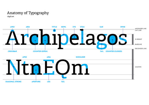
Anatomy of Typography - Letter features and characteristics
Sometimes it can be difficult to explain and identify the different features of a typeface. So, let's take a look at the anatomy of typography!
What is type and lettering?
Type and lettering is something we see every day of our lives. It's used for print media such as signage, brochures, in store, flyers and so on. It's also used digitally on the web, whilst we sift through Facebook and Instagram posts, blogs, or the latest Reddit news.
Typography features and characteristics
So what did I do to help indentify features of type? I've put together a poster, which I have hanging up in my office! It contains all the significant features of type, pointing out features such as a stem, eye, bowl, counter, arm and so on. I've also included x-height, leading and baseline, which identify features outside of the characters themselves. Not only does it help explain certain features, but is also super interesting to have a little bit of extra knowledge regardless of if you're a Graphic Designer or not.
I have excluded a few type features, but the everyday, common features have all been included. This is a great guide for professionals and students alike.
What other posters would you like to see made as a graphic design resource? Comment below to tell me what you'd like to see created!
You're welcome to download the file as a reference or bookmark this page. I've included a link below.
Have fun with type!
You can download the image below.