Holdsworth House Dental - Sydney Dentist Logo Design
Project Details:
Client:
Year:
2025
Tasks:
Symbol / Logo Design, Print Design, Brand Guide and Social Media style.
Holdsworth House Dental provides quality dentistry and expert care to the Sydney community.
This dental studio located in Darlinghurst, Sydney, required a symbol and logotype refinement. Designed to intertwine with their existing brand language, I created a symbol that embodied their fresh approach in dentistry, a high-quality standard and refinement for the inner city dentist.
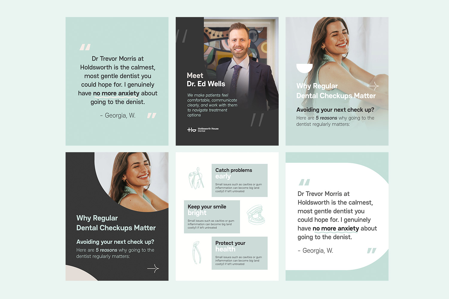
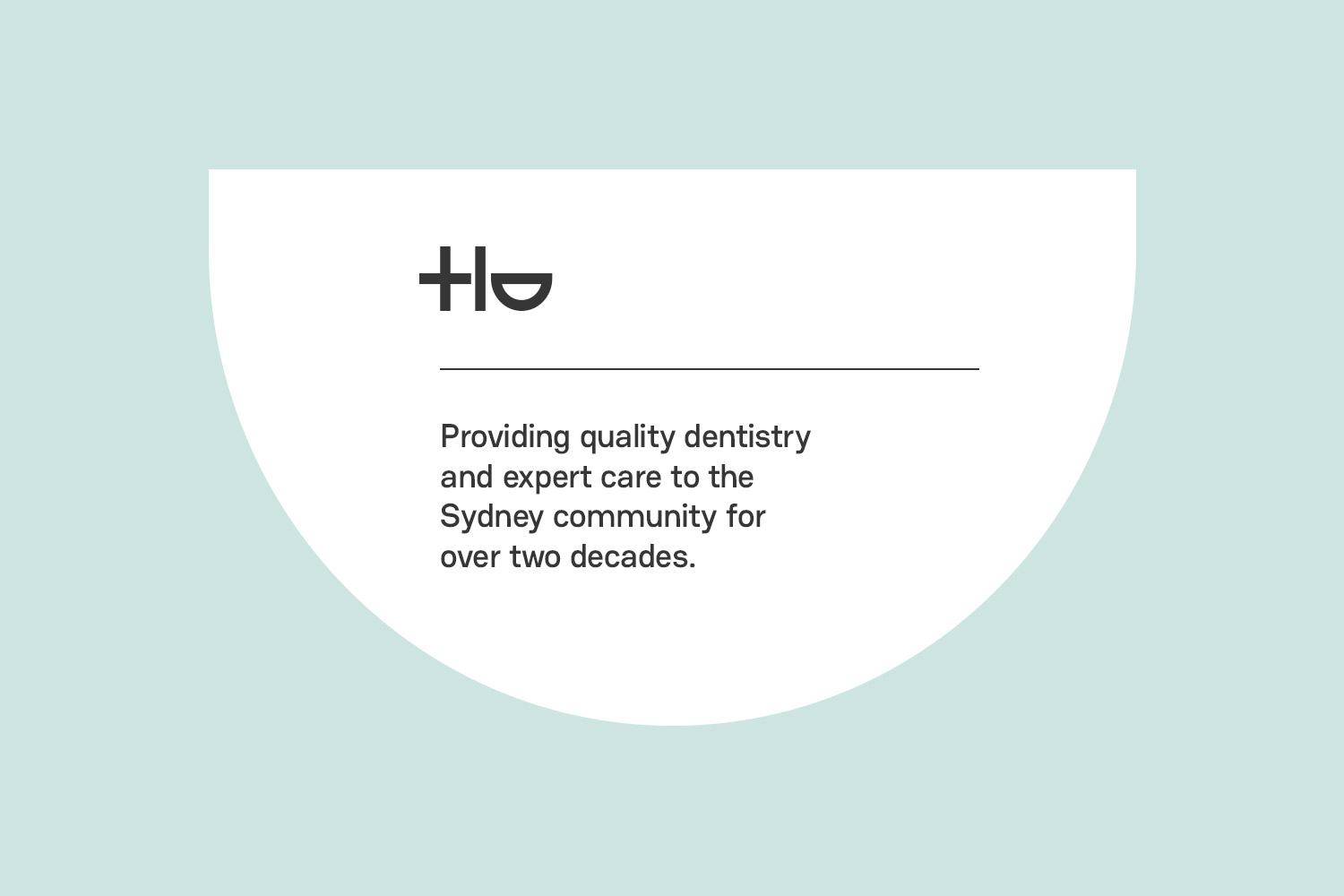
A dentist logo thats refined and considered. Bucking the trend of whats a traditional dentist logo.
The logo was thoughtfully designed to reflect professionalism, trust, and modern dental care while maintaining a clean and approachable visual identity suited to the Sydney market. The symbol design combines minimalist aesthetics with refined typography to create a timeless and memorable brand presence.
A high level of symbol, that incorporates a smile (without incorporating a generic smile).
A brand guide, with clear aesthetic, colours and logo use for this Sydney dentist brand.
The color palette was selected to communicate cleanliness, confidence, and calmness — qualities strongly associated with this contemporary dental practice. The typography complements the symbol with a sleek and sophisticated appearance, enhancing readability across both digital and print applications.
Overall, the logo was developed to provide a versatile and recognisable identity that works effectively across clinic signage, stationery, uniforms, social media, and website branding while establishing a strong and trustworthy presence within Sydney’s competitive dental industry.
A new-age of dentist branding, for Holdsowrth House Dental – a quality Sydney denist.
This symbol was strategically designed to position the clinic as a modern, trustworthy, and premium dental brand within the competitive market of Sydney. Every element of the identity was carefully considered to create a strong first impression while building confidence and approachability for both new and returning patients.
The design direction focuses on simplicity, professionalism, and long-term brand recognition. The icon subtly incorporates dental-inspired forms with clean, balanced geometry to represent precision, care, hygiene, and healthy smiles without appearing overly generic or clinical.
Have you outgrown your branding?
Time to launch into the next phase (or, if you're just starting, that's fine too)!