
Supplement Label Designs and Requirements
Now that I’ve designed for quite a few supplement companies, I’ve got a good grasp on what’s required for supplement label design, how it can be applied on packaging, marketing features and elements, hitting key fitness demographics, and so on. Supplement design, whether it be whey protein powder, a fat burner, casein, (the list goes on doesn’t it?!), is a super competitive industry. And, the clients I’ve had requesting their brand on supplement labels has ranged from start-up entrepreneurs, hobbyist, personal trainers, to larger, more established companies.
Design Requirements
First things first, you need to know what type of products you want to sell. As I mentioned, (and if you’re reading this article you’re bound to be interested in all things supplements), there’s so many different types of supplements in the fitness industry. So, knowing what you want to sell is critical, because more often than not, that will dictate the size of the packaging required. Furthermore, the quantities of protein (for example) generally comes in quite a number of different sizes, in different types of packaging. Some are zip locked, some are in tubs and some in sachets.
Nutrition Information and labels
When a food product is sold to the public, generally a nutrition label is required to go on the product packaging or label. I’m specifically going to talk about Australia and the United States here, and say that both countries do require this information.
 Even stylistically, the nutrition information needs to be designed in a legible way. This can be quite complicated, so please refer to some of these websites which may help:
Australia Food Labelling
Food Standards Australia Nutrition Information Panels https://www.foodstandards.gov.au/consumer/labelling/panels/Pages/default.aspx
Food Standards Australia Nutrition Information User Guide https://www.foodstandards.gov.au/code/userguide/Documents/Userguide_Prescribed%20Nutrition%20Information%20Nov%2013%20Dec%202013.pdf
Australia Made Logo Use https://www.australianmade.com.au/for-business/using-the-logo/
United States Food Labeling
FDA Dietary Supplement Labeling Guide https://www.fda.gov/food/dietary-supplements-guidance-documents-regulatory-information/dietary-supplement-labeling-guide
FDA Nutrition Labeling https://www.fda.gov/food/dietary-supplements-guidance-documents-regulatory-information/dietary-supplement-labeling-guide-chapter-iv-nutrition-labeling
Often the Nutrition Information will be supplied to me by the client. It is their duty to supply the correct information and guidelines for me to complete.
Using a Template Maker
A template maker for supplement design is often a really cheap, inefficient way of doing business. Calculating the costs involved in using a template maker, how often it’s been used by other companies all around the world, legalities, specification sizes and so on, is extremely risky. It would also be a time where, if you find yourself going down this route in business (in general), you might need to ask if you can afford to run a business. A template maker, whilst useful for some things, would be extremely risky.
Let’s talk about custom supplement label design
Ok, onto the fun stuff! Custom supplement label design, something I specialise in, is what I know best. We have some key areas to focus on here, and they include logo design, software, target demographic, style, and printing types / substrates.
Logo Design for Supplement Companies
I’ll talk about target demographics a little bit later on in the article, but logo design is critical to the success of a brand. So much design aesthetic stems from a logo design. There’s so much consideration that needs to take place and if you’re an experienced Graphic Designer then you’d recognise what has the ability to work and what doesn’t. So, please read further down the article where I talk about appealing to a target audience, because that pertains to logo design too.
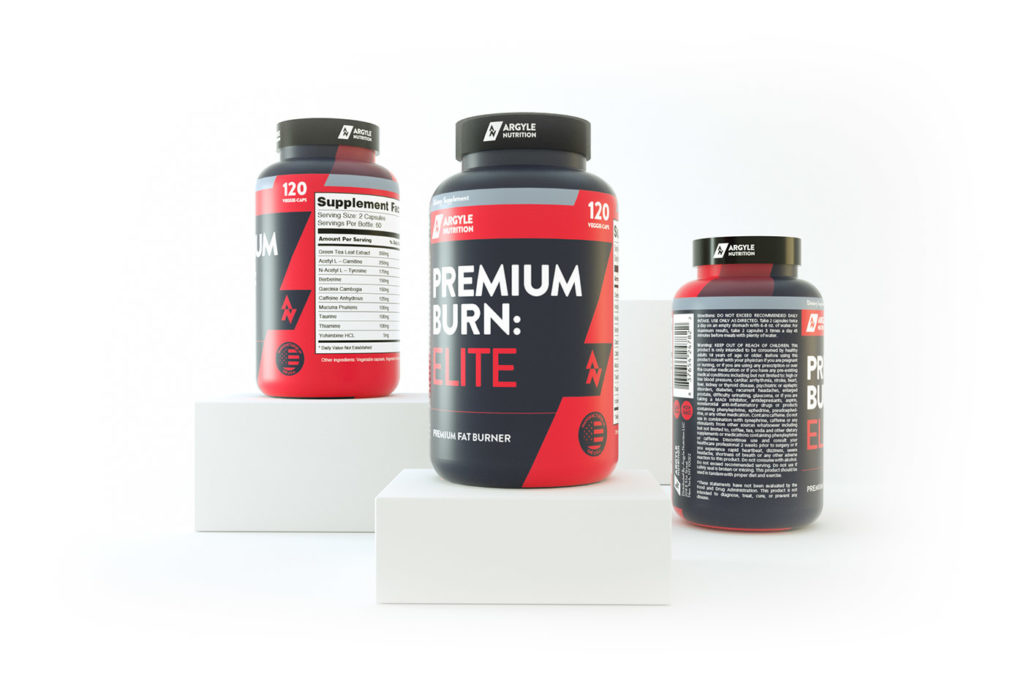
One of my favourite logos I’ve created is for Nitracore, a more hardcore style supplement brand. I created custom type for the company specifically directed to appeal to their target audience.
I’ve also created a logo for Megathom, Argyle Nutrition, Monster Performance, Primo Performance and a few more companies.
![]()
Software to design supplement labels
Generally, labels I design for clients are created in Adobe Illustrator, Adobe InDesign or Adobe Photoshop. However, it’s usually a combination of two or three of those. Consideration of size of label, resources (like photos, the company logo, and so on), and quantity are assessed. Adobe Illustrator is great for label design (and company logo design for that matter), because of its sizing (un)restrictions. The majority of print based work I create for labels is created in Illustrator. InDesign is really useful for larger quantities of work, so if you have a lot of labels to be created in many variations, this could be my choice of software. Photoshop is generally better to make edits to photos and photo manipulation, mocking up products and so on.
Speaking of mocking up products, this is something a lot of clients end up requesting for their fitness business. To show photo quality renders to customers, without the use of actually hiring a photographer, the perfect setting, and so on, is so appealing. You can also rotate the product on different angles, so showing it on a gym floor, or presenting it in a nice, natural (or in some cases, really abstract and stylistic ways) is so engaging. I generally use Cinema 4D – one of the most powerful 3D rendering programs in the world – to create the product renders.
 Designing appealing labels for customers
Supplement labels are no different to most other print-based graphic design work. Considerations for who your target audience should be at the forefront of your mind. For me, that’s certainly the case. Identifying who your customer is could involve the following:
- Location of the customer. This could be as specific as your local area, state, country, multiple countries and so on. Even with the internet, it’s important to realise who are typically visiting your website.
- Physical abilities of your customer. Are they just starting out in fitness? Is it their hobby? Are they semi-professional? Professional athletes?
- Age of your customer. Younger demographic? Older?
- Gender specific product or a skew towards a certain gender.
- Your main competition. Are their labels similar to yours? How can you differentiate yourself from the competition?
- Cost of your product relative to the competition. This is so important, because often consumers will look at your product side by side with another, similar product. If their protein powder looks and feels more expensive, that may mean that they opt for their product, or end up using yours because it in fact looks and feels cheaper.
Often clients will approach me and state that they want their product to appeal to everyone. And yes, that would be fantastic! However, it’s never the case.
If we look at a company like Optimum Nutrition, for example, who are iconic with their label designs, they’ve made their labels appear expensive, the typography used demonstrates their product is more geared towards hobby to semi-professional athletes, at a mid-range demographic and a slight skew towards males. With all of that considered, the price point for a brand like Optimum Nutrition is generally more expensive, and that’s because of their more luxurious look. Now, they also have the backing of reputation, too.
Supplement Packaging, Bottles, Sachets (etc).
After the logo and supplement label is designed, often clients will print their labels onto tubs, bottles and sachets depending on the sizes of their products. There’s such a wide range of options in regards to printing.
A few options could be:
- Matte / Glossy Paper
- Silver Metallic Paper, sometimes with a white underprint.
- White Film BOPP Polypropylene which is great because it’s waterproof and tearproof
- Clear Film BOPP Polypropylene
- Chrome Film BOPP Polypropylene
There’s a range of costs involved in regards to quantities, types of print, quality, paper and so on. They’re best discussed on a case-by-case situation.

So that’s about all for supplement label design in terms of a general guide. I hope it’s helped give you a better understanding of what’s required. Feel free to contact me if you have any questions!
Logo Design - Typical Creation Process
Logo design always throws up all sorts of discussion. Why do some designers charge so much / little for a logo? Why does it take so long to design a logo? What are the benefits of having a logo? And so on.. Well, in this artcile, I'm going to discuss a little bit about the design process when creating a logo. We'll be discussing all sort of things from concepts to final production. Many variables come into play in the process, so I'm going to keep it as general as possible in order to try and communicate the process as best as I can. Here goes!
The Logo Design Brief
The brief is extremely important for a logo design. Mainly because what I'm about to create is the face of your company and it's important for me to know as much relevant information about the client's company as I can. So, not only is timeframe, a factor when designing a logo (or anything for that matter), but details regarding your business are just as important.
Here's a list of some areas of critical information which is extremely important in regards to logo creation:
- Business size – sole trader, micro, small, medium, large.
- Business age
- Tagret demographic – almost the most important piece of information. Who are you trying to appeal to?
- Product / service cost – who do you cater for, socio-economic wise?
- Competitors
- Budget
Initial brainstorming / sketches of the logo design
I always begin a logo design with paper, pencil and my A3 sketch book.
Generally, I'll begin with a mindmap, of sorts, or key words about the company, style of the logotype, symbol, colours I may potentially use, the mood of the logo and so on. I believe in writing down as many words to describe what I'm trying to achieve as possible, but I want the words to be accurate to the company, it's beliefs and the target audience.
![]()
For my sketches, I very rarely use an eraser, because at this point, the sketches are quite quick and purely encompass an overall style for the logo. The amount of pages I go through for a project really depends on the complexity of the brief. Sometimes it's just a page of sketches, other times 3 - 4 pages. Again, I'm happy to sketch out whatever I feel is relevant to the brief. Whether or not it's going to end up being the final final doesn't worry me at this point in time. Often I'll sketch things which I know won't even be considered, but sometimes they're the link between two very different concepts.
Execution of my sketches isn't hugely important. Some effects and techniques I'll know I can execute better on a computer when I get to that stage.
Designing a logo in Illustrator
Once I've completed my sketches, I'll jump into Illustrator and start playing with a few concepts. I sometimes bounce between my computer and sketch book, just to jot down or sketch out a new idea first. For some sketches which I've done quickly by hand, I know how they'll look digitally, but look very different in my sketchbook.
![]()
I always design my logos in Adobe Illustrator, regardless of time, who the client is and what they're going to use it for. It is the best application for creating a logo due to the tools available and the accuracy in which it can be produced. Also, as a vector file (which Illustrator handles), I know I'll be able to make the logo as big or as small as I (or the client) want to in the future. I'll begin experimenting with typography, lettering, shapes and scalability of the logo constantly. Scalability is often overlooked by designers and clients alike, as a logo might look fantastic in a large size, but when resized to a smaller size it's unreadble. Having a secondary window open at a smaller scale can also be beneficial.
It's difficult to cover all types of logos in one article, but in general it's important to use as few points as possible in the logo and make it as clean as possible. There shouldn't be any waste.